Quantcast
Channel: Viget Articles
Viewing all 1271 articles
Browse latest View live

TTT: Navigating the Waters

$
0
0

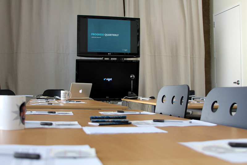
Last month, each office met separately for our Quarterly Progress Meeting and I'm happy to report that we are making progress!  We discussed topics such as small projects vs. big projects, responsive design, and our onboarding process.  We concluded each meeting by identifying key traits for both current and potential Vigets.  Some of the top traits, among a long list of others, were "driven", "talented", "light-hearted", and "curious."

After the meetings, we slathered on the sunscreen and bug spray and spent some time in the great outdoors.  Our Third Third Thursday tradition (which we affectionately call TTT) of getting out of the office together remains strong.

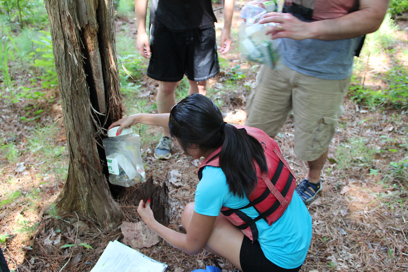
With GPS devices and a list of clues in hand, Durham set out in canoes in search of treasure hidden by Frog Hollow.

Falls Church spent the afternoon in Georgetown paddling with Key Bridge Boathouse (formerly Jack's Boathouse).  They made their way around Theodore Roosevelt Island, taking in the National sites while riding kayaks, canoes, and stand-up paddleboards.

The Boulder office met up with Rocky Mountain Paddleboard at Gross Reservoir to test out their sea-legs on stand-up paddleboards.

The backdrop was gorgeous and the water was calm...

...unless these guys were chasing you down and trying to knock you off your board.

It was scorching hot on all three days, so the occasional splash or accidental tip into the water was enjoyable and made for some good laughs.

All three Viget offices will be in one location at the next TTT in October, which we always look forward to.  I don't know exactly what the event will be yet, but whatever we do will surely carry Viget's Good Time Guarantee!


Stop! Are you Really Ready for a Redesign?

$
0
0

The need for a redesign is agreed upon, the budget is approved, and a vendor has been chosen; you have everything needed to begin a full website redesign, right? Possibly, but not necessarily.

Viget Boulder recently hosted a Project Management Meetup in which Josh Zapin, Global Director of eCommerce Operation at Crocs, discussed lessons learned from the recent www.crocs.com redesign. The presentation was extremely interesting, and one of the points that most resonated with me was the value in having an organization truly prepared for a redesign, as it made me realize some lessons from our past work seem to be universally true. Even if you have the greatest vendor(s) in the world working on your redesign, it can’t be a success without a few things from you.

Do you know how your internal approval process will work?

A question that is guaranteed to come up at any Viget kickoff meeting is, “What is your approval process like?  Who needs to approve the assets before we can consider them final?” I would imagine that’s a common question in any kickoff, and it’s not only important for you to know the answer, but it’s important for you to be honest about it as well. I think at times it’s tempting to downplay the fact that a few people who aren’t in the room will also need to see assets before moving forward, but this is important information for everyone involved in the project to know and understand.

It’s only natural for a lot of people at the company to want to see assets and provide feedback when the company is undergoing a major redesign. Outline who those people are and be realistic internally about the fact that if that list of people changes or expands, there will be impacts on timing.

Do you have goals identified, and benchmarks measured?

So let’s say you’d like to see an increase in email signups on your site, but by how much? What are the benchmarks for before and after comparison, knowing the number of people signing up for an email might fluctuate depending on promotions, season, publicity or other factors? Are there other measurements you could make or data points you could gather to supplement measuring these goals?

In addition to knowing how many signups you average per day, week, month and year, it would also be great to know how many people get to the email signup page. How much time are people spending on the sign-up page now, and how many of them leave as soon as they arrive at that page? All of these things together can help you see the big picture. Without the additional data points, you might see a 5% increase in email subscriptions and call the redesign a success without realizing there was a 90% increase in the number of people reaching the signup form. Knowing there was a 90% increase in people reaching the form, but only a 5% increase signups would highlight that something isn’t going quite right, and it’s time to test and find out why.

Do you have team members prepared to make this happen?

Having a vendor work on your redesign does not mean your team is off the hook for being engaged and devoting time to the project. You need to have a team in place dedicated throughout the project. Attending reviews, answering questions, providing feedback (or gathering feedback from other people in the company), and focusing on the end budget and timeline will take more than an hour or two a week. A vendor is doing the bulk of the actual work, but progress and efficiency during the project will hinge on your involvement. In order to make your dreams come to life, they need your dedication and time as well.

You’re ready to dive in

Not all of those factors are critical to having a successful redesign, especially since what defines a redesign as a success varies from company to company, but if you can answer ‘Yes’ to all of those questions you are no doubt in a great position moving into the redesign.

What are some other factors you see as important for companies to have a pulse on before embarking on a redesign? What other factors are important for companies to have a pulse on before kicking off a redesign? I’d love to hear a client’s perspective on what you feel they can be done to prepare as well!

Product, Agency, or In-house Team? What To Look for in Your First UX Job

$
0
0

A couple weeks ago, Laura wrote a great post on starting her UX career at an agency. Having started my UX career at a product company, this sparked a conversation between the two of us about product vs. agency life and what qualities are most important in your first UX job. This post is the result of that conversation.

The Unique Aspects of Working at a Product Company

There are notable similarities between product and agency life. Both have the potential to offer projects that build a range of UX skills, allow you to work with talented folks across teams, and help hone your critical thinking skills.

However, the key differences between product and agency life is the variety of projects on which you work. At a product company, you’ll gain a deep understanding of one product. At an agency, you’ll work on a range of projects with different clients. Both have their own advantages and challenges.

Since Laura covered some of the benefits of working at an agency, I’d like to discuss some of the benefits I experienced at a product company:

  • Time for iteration – Working on a product affords you the luxury of diving deep into the iterative process, since strict client budgets are not a concern. As a first-time designer, this taught me to think critically about UX.
  • Customer relationships – At a product company, you get to build relationships with a customer base. Regularly talking to customers helps to build empathy, a critical skill for any UX designer.
  • Helping a product grow – There is nothing like the mental workout you get from learning to design in a way that helps a product grow while simultaneously leaving current customer’s workflows uninterrupted.

Which is Better for My First UX Job – Product Company, Agency, or In-house Team?

If you’re applying for your first UX job and you’ve read both Laura’s and my blog posts, you may be confused. Both agencies and product companies sound awesome. There’s also the option to work in-house. What’s the “right” place to start your career?

The good news is that the best place to start your career does not depend on company-type, but on your priorities. To decide whether an agency, product company, or in-house team would be best for you, I’d recommend considering the following:

  • Do you want to work on a variety of projects, explore different industries, or establish an area of interest? Are you looking for a fast-paced environment that comes with the possibility of putting in long-hours around a deadline? If the answer to these questions is yes, then agency life may be a good fit.
  • Are you interested in seeing how the iterative process helps a product grow over time? Do you want to work with a consistent customer base? Are you OK with your projects revolving around the same product for an extended period of time? If the answers to these questions is yes, then a product company may be your best bet.
  • Are you interested in working on a variety of projects in a specific field? Would you like to help form a UX-minded culture in an organization? If the answers to these questions is yes, you'll likely enjoy working on an in-house team.

Thinking about where you’d like to start out will help focus your job search and increase the likelihood you’ll find a good fit.

The Three Most Important Factors in Your First UX Job

Working at an agency, product company, or on an in-house team can provide opportunities for growth and challenge. However, there are three critical factors which I believe can make or break you first UX job.

  • Challenging work – You want to be learning rapidly. During an interview, make sure you’ll be doing challenging work, and not just doing menial work on flashy projects.
  • Talented team members – Working with a talented and excited team will help you grow as a UX designer. If people lack motivation, it will bring you down fast and hinder your professional growth.
  • Opportunities for mentorship – Ideally, there will be someone at your first UX job who is concerned about your professional development. To be clear, this is not a hand-holder, but someone who can provide guidance and make sure you’re working on projects that challenge and excite you.

Fortunately, you can find great projects, incredible people, and caring mentors in agencies, product companies, and on in-house teams. The challenging part is sussing out whether a prospective company provides these things. As long as you do your homework, there’s a good chance  you’ll start your career on the right path no matter what type of company you prefer.


Refactoring to Backbone.js

$
0
0

Deciding mid-stride to adopt a JavaScript application framework exposes many difficult decisions. What should be targeted first? How does one deal with untested, legacy code? It can make transitions a scary, tedious process.

At Viget, we've found Backbone to be a great tool for bolstering existing code with greater structure and functionality. With an active community and a number of superset frameworks (such as Thorax and Marionette), it gives us flexible tools to tackle current problems with an outlet for more elegant solutions down the road.

We've started to trend towards a series of steps that help to translate code over in a safer, more testable way.

Let's start by considering the following code:

function News(options) {
    this.$container = $(options.container);
    this.$element = $("<ul>", { class: 'news-widget' });
};

News.prototype = {

    addEntry: function(data) {
        var entry = $("<li>"),
            date = new Date(data.date);

        var prettyDate = [
            date.getMonth(),
            date.getDate(),
            date.getFullYear()
        ].join('/');

        entry.append("<h3>" + data.title + "</h3>");
        entry.append("<p>" + prettyDate + '<p>');
        entry.append("<p>" + data.summary + '<p>');

        this.$element.append(entry);
    },

    getNews: function() {
        var url = "/my/api/news/",
            request = $.getJSON(url),
            news = this;

        request.done(function(data) {
            $.each(data, function(story) {
                news.addEntry(story);
            });
        });
    }
};

This sort of code isn't terrible, but I've intentionally inserted a couple of problems into it that we'll address during our refactor.

Pull HTML construction into a template

Before anything else, JavaScript HTML construction should be moved into a template. I like to do this first because it clears the way for us to focus on a much harder problem: breaking out data processing into template helpers and methods of Backbone.Models and Backbone.Collections.

Let's rewrite that addEntry method, by making a JavaScript template. On most projects we let the Ruby on Rails Asset Pipeline manage our templates. We'll use Handlebars for this example. I love working with Handlebars because it has a great API for writing template helpers and the handlebars-asset gem does a lot of work to setup templates behind the scenes.

Assuming I've added the handlebars-assets gem to my Gemfile, this lets me include templates like so:

{{! templates/news_item }}
<li class="news_item">
    <h3 class="news_item_title">{{ title }}</h3>
    <p class="news_item_meta">{{ prettyDate }}</p>
    <p class="news_item_summary">{{ summary }}</p>
</li>


//= require templates/news_item
News.prototype = {
    template: HandlebarsTemplates['news_item'],
    //...
    addEntry: function(data) {
        var date = data.date;

        data.prettyDate = [
            date.getMonth(),
            date.getDate(),
            date.getFullYear()
        ].join('/')

        var entry = this.template(data);

        this.$element.append(entry);
    }
    //...
};


Cool, that fixed that problem. But why does addEntry calculate prettyDate? This should either go into a template helper or a method of a Backbone.Model. Since we may want to use this transformation somewhere else in the application, let's make a Handlebars helper that produces the same result.

Handlebars.registerHelper('prettyDate', function(dateString) {
    var date = new Date(dateString);
    return [
        date.getMonth(), 
        date.getDate(), 
        date.getFullYear()
    ].join('/')
});


{{! templates/news_item }}
<li class="news_item">
    <h3 class="news_item_title">{{ title }}</h3>
    <p class="news_item_meta">{{prettyDate date}}</p>
    <p class="news_item_summary">{{ summary }}</p>
</li>


News.prototype = {
    //...
    addEntry: function(data) {
        var entry = this.template(data)
        this.$element.append(entry);
    }
    //...
};

Cool, no? Moving data transformation into template helpers is one of my favorite parts of refactoring. Over the course of a project, templates grow into powerful tools that can significantly reduce repetition.

We can go a step further, though. Instead of appending a bunch of strings to the end of the list of news items, we can delegate it to Handlebars. This is a perfect use case for partial templates.

Let's put an underscore in front of the file name for our item template, so that handlebars-assets knows to register it as a partial. Then we'll make template that can iterate over a list of items.

{{! templates/_news_item }}
<li class="news_item">
    <h3 class="news_item_title">{{ title }}</h3>
    <p class="news_item_meta">{{prettyDate date}}</p>
    <p class="news_item_summary">{{ summary }}</p>
</li>


{{! templates/news_list}}
{{#each items}}
    {{> _news_item}}
{{/each}}


//= require templates/_news_item
//= require templates/news_list
News.prototype = {
    template: HandlebarsTemplates["news_list"],
    itemTemplate: HandlebarsTemplates['_news_item'],

    render: function(data) {
        var markup = this.template({ items: data });
        this.$element.html(markup);
    },

    addEntry: function(item) {
        var markup = this.itemTemplate(item);
        this.$element.append(markup);
    },

    getNews: function() {
        var url = "/my/api/news/",
            request = $.getJSON(url),
            news = this;

        request.done(function(data) {
            news.render(data);
        });
    }
};

When the News object gets fresh data from the server it will now invoke the render method. This gives us better control over output when dealing with changes in data later on. By using a template partial, News supports the ability to iterate over items with a “list” template while still having enough control over markup to append an additional item if need be.

With a strong foundation built for HTML construction it's time to focus on data. In the next steps we'll draw greater focus on how information flows, and how to handle when things change.

Break out Data Processing

Now that construction of the markup has been tucked away into a template, we can focus building the data layer for our News object. In this step, we'll pull all data handling into a Backbone.Model and Backbone.Collection; hooking into the events Backbone provides to support the existing functionality.

var NewsModel = Backbone.Model.extend({
    urlRoot: '/my/api/news'
});

var NewsCollection = Backbone.Collection.extend({
    model: NewsModel,
    url: '/my/api/news'
});

The Backbone.Model and Backbone.Collection can already handle fetching data from the server using the fetch method, so the getNews method we saw earlier can be completely eliminated from News. We'll see how that fits together in the next step.

Finishing things up with Backbone.Views

All that's left is to go full circle, by converting what we have left into a Backbone.View. Usually at this point, the final step is very simple. Our final Backbone.View looks like:

//= require templates/_news_item
//= require templates/news_list

var NewsView = Backbone.View.extend({
    tagName: 'ul',
    className: 'news_widget',

    template: HandlebarsTemplates['news_list'],
    itemTemplate: HandlebarsTemplates['_news_item'],

    initialize: function(options) {
        this.listenTo(this.collection, {
            'reset' : this.render,
            'add'   : this.addEntry
        });
    },

    render: function() {
        var markup = this.template({
            items: this.collection.toJSON()
        });

        this.$el.html(markup);
    },

    addEntry: function(model) {
        var markup = this.itemTemplate(model.toJSON());
        this.$el.append(markup);
    }

});

That's it! Now all that is left is to instantiate NewsView and rejoice

var news = new NewsView({
    collection: new NewsCollection()
});

news.$el.appendTo(".news-container");
news.collection.fetch();

The example we looked at in this post dealt with code that was very straightforward to refactor. However we've used this technique in the past to effectively rework highly complicated code. By focusing on one task at a time and moving in a natural progression, this technique lets us iterate more quickly, seeing the results of reorganization much sooner.

See a gist of the final result

The Weight of Intuition

$
0
0

Intuition Mountain

As designers we are tasked with helping our clients define their visual voice: a note that will carry weight to their consumers, engage them in conversation, and hopefully leave a desired impression. We help to bolster brands, sell products, raise awareness for a cause, and along the way we hope that if we do our job right it will invoke a response. Alongside our teammates from other disciplines we tackle projects head-on, look at them from all sides, scour analytics, pull research papers, look for trends in user experience and consumer expectations, bang our heads against walls until ideas come out.

As part of this process we rely on the tools of our trade to help us translate our ideas into visual deliverables, pull the foundational principles of design around us like a blanket, trust in a process that produces something, anything, that can get the buy-in we're looking for.

The reality is that the tools we have to win a client's trust and approval aren't really what we sell as designers. Mood boards will only get you so far. Story boards will only explain so much. Type specimens will rally only so much support. Design theory will only dazzle clients to a point. Stripped of the multitude of tools in the box we really only have one thing going for us: intuition. Maybe you were born with it; maybe it was built over years of sweating it out, working hard, and learning from your mistakes. Maybe it's a little of both. Maybe it's a lot of both. 

Intuition is subjective. It's in your gut, instinctual and personal. It can impact anything from the tiniest details to the biggest concepts. It manifests itself as style, mood, taste, and trend. It can't be tracked, quoted, read back, sourced, or accepted at face value, yet it's so core to a design project's success it's a wonder why we choose so rarely to explain our work with the response "Because this feels right!"

The reason why? Because you cant sell intuition on its own. It won't fly. It's not a tangible deliverable. Intuition is never a dish served à la carte, it's always prepared casserole style, mixed with bigger bits of solid data and reliable facts that bolster our claim that we've found the right solution.

Why do we need to build a solid foundation of truths around intuition? Because intuition is messy. It's illogical and dangerous. It throws out the notion that solving problems should be derived from 100% logic. So it gets buried, tucked away under a Yucca Mountain of deliverables and process. But it's important to recognize that it's there, that it has a place in the design process, that sometimes the best solutions are the best because it just feels right; because no matter how hard we try to apply pragmatism to all the things we do, intuition is bound to bubble up and mix itself into our work, fusing with the bedrock of logic we've built around it.

And that's ok. That's the way it should be.

3 Approaches For Tackling Collaboration Challenges

$
0
0

As a UX Designer at Viget, I’m often responsible for guiding the collaborative conversations that we have both internally and with our clients throughout the design and development process.  Collaboration generates stronger ideas and better final products, but only when it works well.  Whether it’s attendees that don’t know their purpose, participants that don’t want to open up, or a team that doesn’t know or trust one another, there are plenty of challenges that can occur while collaborating that get in the way of making actual progress.  When faced with issues like these, I like to lean on the following three approaches:

1. Empathize with Your Co-Collaborators

When we facilitate a collaborative meeting, we are crafting an experience.  As UX designers, we constantly push ourselves to empathize with our users.  I feel a similar responsibility to empathize with my co-collaborators. 

Put yourself in your co-collaborators’ shoes to figure out the best approach to facilitation.  Someone who’s never worked in a collaborative setting that involves sketching interfaces may be hesitant to pick up a pen and draw in front of a group.  A shy co-worker may not feel comfortable sharing his ideas with the groups unless he receives as much information as possible ahead of time and has plenty of time to think and formulate ideas.

Try to understand how your co-collaborators might feel and, more importantly, have the compassion to do something about it.  If we ensure that they are comfortable, we will create a space where people are actually excited to collaborate. 


2. Break The Group Up

I find it difficult to get the conversation rolling and hear everyone’s perspective when collaborating with a large group.  If I’m facilitating a discussion with more than 5-6 people, I’m probably going to break the group up at some point. 

At the beginning of a conversation, I create smaller groups containing 2-3 people.  When both the client and the internal team are participating, I like to form groups that include members of each team.  Each group discusses the topic individually.  I often walk around and listen in on the conversations and provide feedback or help push the discussion along.  When I bring the whole group back together again, everyone is more comfortable sharing their ideas because they’ve already thought about the topic and come up with a joint perspective. 

Breaking the group up helps get the conversation off to a better start and makes it easier to hear more perspectives. 


3. Try Something New

I have been an hour into an all-day meeting to find that my planned agenda just isn’t cutting it.  The conversation isn’t flowing and we’re not getting the answers we need.  The exercise I’m attempting to facilitate falls flat.  My expectations and the client’s expectations for the project are not aligned.  When that happens, I keep calm.  It just means that it’s time to try something new. 

I find that small tweaks such as re-wording your questions or asking a different person can help re-route an entire conversation and get the answers you need.  If the group doesn’t respond to an exercise, I like to re-group and try to present it a different way; replace it with another exercise, or just move to a guided conversation.  If expectations are misaligned, I bring in a member of the project management or business development team to help reset those expectations and bring the group to consensus. 

It’s important to prepare yourself with a backup plan for when things don’t go as planned and to not fear mixing things up and trying something different. 


There are countless challenges that can occur while collaborating with our clients and peers, but remembering to empathize with your co-collaborators, break the group up, and try something new can go a long way to helping you overcome them.  I believe that effective collaboration enhances my ability to do my best work, so when roadblocks come up, I remind myself they are worth overcoming.    If you have your own approaches for dealing with collaboration challenges, I’d love to hear about them.

Interested in Learning a Little Viget Trivia?

$
0
0

As the unofficial Viget historian and lover of all things trivial (I am a Wednesday night Pub Quiz regular), I am often asked about the early days of Viget -- and newbies, especially, seem to enjoy learning about interesting and unusual events in Viget’s past.  Here are just a few quirky facts about Viget, all true:

  • Viget had quite a music industry clientele at one point.  Our former clients include Usher, Shania Twain, Dave Matthews Band, Kenny Chesney, Britney Spears, Backstreet Boys, Rick James, 50 Cent, George Thorogood, Kevin Federline, North Mississippi Allstars, Kid Capri, and Jewel.
  • For about 2 years (many, many years ago), our office neighbor was a telemarketing firm who primarily employed felons on day-release from prison, many of whom were members of a gang not to be named here.  They would terrorize us in the hallways, bathrooms, and parking lot.  Scary times, but cheap rent!
  • The most memorable interview candidates include the guy who sat through all his interviews wearing a blinking Bluetooth device in his ear and the guy who walked into the interview in full motorcycle apparel.
  • Pop was a pilot for United Airlines when he wasn’t writing PHP code for us or wiring phone lines in our office space.  On 9/11, he was flying a 737 on the West Coast while we watched CNN in our first real office which was just down the road from the Pentagon.   
  • We really don’t like people who just show up unexpectedly to apply for a job.  Nonetheless, sometimes it happens.  And, on one very rare, very special occasion, their resume was so good and they were so charming and gracious that they won us over.  Zach, you continue to be an awesome hire!
  • Our building once employed a man named Frankie who was: 1) an electrician; 2) a magician; and 3) a pet tiger owner who used to occasionally bring his tiger into the office.  He was a fascinating man who used to lick his fingers and touch the wires before beginning any electrical work.  (Do not try this at home!)
  • During the frightening times that the DC sniper was terrorizing the metro area, we occupied office space in Seven Corners, right across from the Home Depot where one of the attacks occurred.  In the pre-dawn hours and evenings, Brian used to dart through the parking lot in a crouched position from car to car to avoid getting shot.
  • Patrick was our first “stranger hire” back in 2000.  Famously, we were all out to lunch when he arrived for his interview and we found him wandering the hallway upon our return. Undeterred by our initial bad impression, he became our newbie PHP developer and, in 2005, our Development Director.  We can’t imagine Viget without him.
  • One of our awesome clients had a table-top version of Ms. PacMan delivered to our office as a thank-you for meeting a tough deadline.  We play it to this day and have incorporated it into past charity events.
  • Andy, an ardent animal-lover, once had pet lovebirds that had babies who needed to be hand-fed every four hours by medicine dropper.  He used to bring their birdcage into the office every day so he could feed them when necessary.  This provided endless fascination for the 3 office dogs we had at the time.
  • Our first Durham office was next to a catering business with a hot-tempered owner.  As several of us were walking by one day, an old-school phone came flying out the door, narrowly missing us.
  • We used to have an enclosed porch as part of our Durham office where we kept our ping-pong table.  We played in that sweltering greenhouse every day, even when the thermometer hit 110 degrees!
  • When we were shopping for our first office space in Boulder, our options were space above, below, or down the hall from a marijuana dispensary (we went with above).

Funny and unusual events happen at all workplaces -- taking a moment to remember and capture some of them here at Viget has been an enjoyable diversion.  I hope you’ve enjoyed a trip down memory lane with me.


Check Your Breakpoint using this Simple CSS Snippet

$
0
0

When you’re looking at a 1400 pixel wide comp you never know when and at what point the design will demand a breakpoint. Most of us discover where a breakpoint is while we're actually resizing the site in the browser. To streamline this process a bit here's a small snippet I use during buildout to see exactly what breakpoint I'm working with.

Video Demo

Notice the tooltip to the top right of the browser changing based on the screensize.

The Code

Below is the barebone's CSS that would display your current breakpoint at the top of the page:

body:after {
  content: "Default";
  left: 50%;
  position: fixed;
  top: 0;
}

@media only screen and (max-width: 600px) {
  body:after {
    content: "Small";
  }
}

@media only screen and (min-width: 601px) and (max-width: 1200px) {
  body:after {
    content: "Medium";
  }
}

@media only screen and (min-width: 1201px) {
  body:after {
    content: "Large";
  }
}

That's it. The above CSS creates a pseudo-element on the body which changes the content based on a defined breakpoint. For a screen width of 600 pixels or less the content of the pseudo element will be swapped out for, "Small"; between 601 and 1200 pixels, "Medium"; and anything 1201 pixels or larger it would be, "Large". It helps to set a default content so you can see at what screen sizes you are not specifying in a given view.

Since it's just CSS, we might as well style it. Here's a more stylized SCSS version I use on my projects, and the Codepen demo below:

See the Pen agABu by Tommy Marshall (@tommymarshall) on CodePen

Do you have any tips or tricks you utilize when building out responsive views? Share them in the comments below!


Simple, Secure File Transmission

$
0
0

Often I need to send a file containing sensitive information, like a database dump or a digital certificate, to a client or fellow developer. It’s difficult to know the correct level of paranoia to exhibit in situations like these. Obviously, nobody’s sitting in front of a computer in a dark room, just waiting for me to leak the SSL certificate for the staging Solr EC2 box. At the same time, I know there are many people with access to my email, my Dropbox, my Basecamp posts, and it would be irresponsible of me to rely on their collective good faith to keep this information secure.

I’ve settled on a simple solution that doesn’t inconvenience the sender or receiver too terribly much (assuming they’re both on modern, Unix-compatible machines) while making things considerably more difficult for any would-be eavesdroppers. Suppose I want to send an AWS PEM certificate to Chris, disregarding the fact that he’s sitting maybe four feet from me right now. Here’s what I’d do:

Step 1: Encrypt with OpenSSL

I have a short shell script, encrypt.sh, that lives in my ~/.bin directory:

#!/bin/sh

openssl aes-256-cbc -a -salt -pass "pass:$2" -in $1 -out $1.enc

echo "openssl aes-256-cbc -d -a -pass \"pass:XXX\" -in $1.enc -out $1"

This script takes two arguments: the file you want to encrypt and a password (or, preferably, a passphrase). To encrypt the certificate, I’d run:

encrypt.sh production.pem \
"I can get you a toe by 3 o'clock this afternoon."

The script creates an encrypted file, production.pem.enc, and outputs instructions for decrypting it, but with the password blanked out.

Step 2: Send the encryped file

From here, I’d move the encrypted file to my Dropbox public folder and send Chris the generated link, as well as the output of encrypt.sh, over IM:

Once he acknowledges that he’s received the file, I immediately delete it.

Step 3: Send the password (via another channel)

Now I need to send Chris the password. Here’s what I don’t do: send it to him over the same channel that I used to send the file itself. Instead, I pull out my phone and send it to him as a text message:

Now Chris has the file, instructions to decrypt it, and the passphrase, so he’s good to go. An attacker, meanwhile, would need access to both his Google chat and iOS messages, or at least a sweet $5 wrench. (Friday is two-for-one XKCD day, in case you missed the sign out front.)


So that’s what I’ve been doing when I have to send private files across the network. I’m sure a security expert could find a hundred ways that it’s insufficient, but I hope said strawman expert would agree that this is a much better approach than sending this information in the clear. I’m curious what others do in these types of situations – let me know in the comments below.

Thinking About Context

$
0
0

Successful user experiences boil down to a deep appreciation of context. Consider the following. We write specifically for the web because reading online is clearly different than reading a novel. We integrate social media because it's well-established that Facebook, Twitter, and the like drive traffic. We advocate for responsive design because screen size can change an experience. These practices influence our designs because they account for the circumstances—the context—in which our interfaces are used.

While practical, context at this level is actually quite shallow. In our world today, technology, the web, and connectedness are fundamental to our existence, impacting how we behave and think. As a result, context in the broadest sense is really about our evolved relationship with this digital landscape.

Imagine you're launching a product website. The product you are designing solves a problem, but your target users are probably making do without it. You expect their full attention, but they're most likely multitasking or distracted. You want these folks to download your app, but their phone is already filled with pages of once-opened apps. To keep them invested, you send targeted emails, but people are drowning in email.

All in all, this is the real context in which we design and build websites. It's a challenging environment made possible by technology and enabled by both those who produce and those who consume.

In this reality, it is then our responsibility, as producers of user experiences, to design through this context. How does this thing I'm designing actually fit into people's lives? How can I earn and keep someone's trust? How can I contribute to the digital landscape without adding to the noise? As the distinction between offline and online blurs, these questions about context are what matter.

Constructing Split Tests with Stanley Black & Decker

$
0
0

For more than two years, Viget’s digital analytics team has been working with Stanley Black & Decker, the company behind brands including Black & Decker, Dewalt, Porter Cable, Stanley Tools, and Bostitch.  We’ve partnered with their team in analytics-specific engagements to make their digital efforts as measurable as possible and to enable better data-driven decisions.

Recently, we’ve been working with SB&D to improve the effectiveness of their existing sites through split testing, and we're excited to share some examples -- some of which have led to six-figure impacts in online revenue.

A quick primer on split testing: we create different variants of a page, then randomly serve a particular version to each visitor.  We set a cookie so that users don't see multiple versions of the same page and get confused.  Measuring the percentage of visits who view each version and ultimately complete our site goals, we can determine a “winning” page.  We just need a difference in conversion rates and enough visitors to minimize the possibility -- beyond a specific statistical threshold -- that the difference in conversion rates is the result of random variation.

Now, let’s get to the tests!

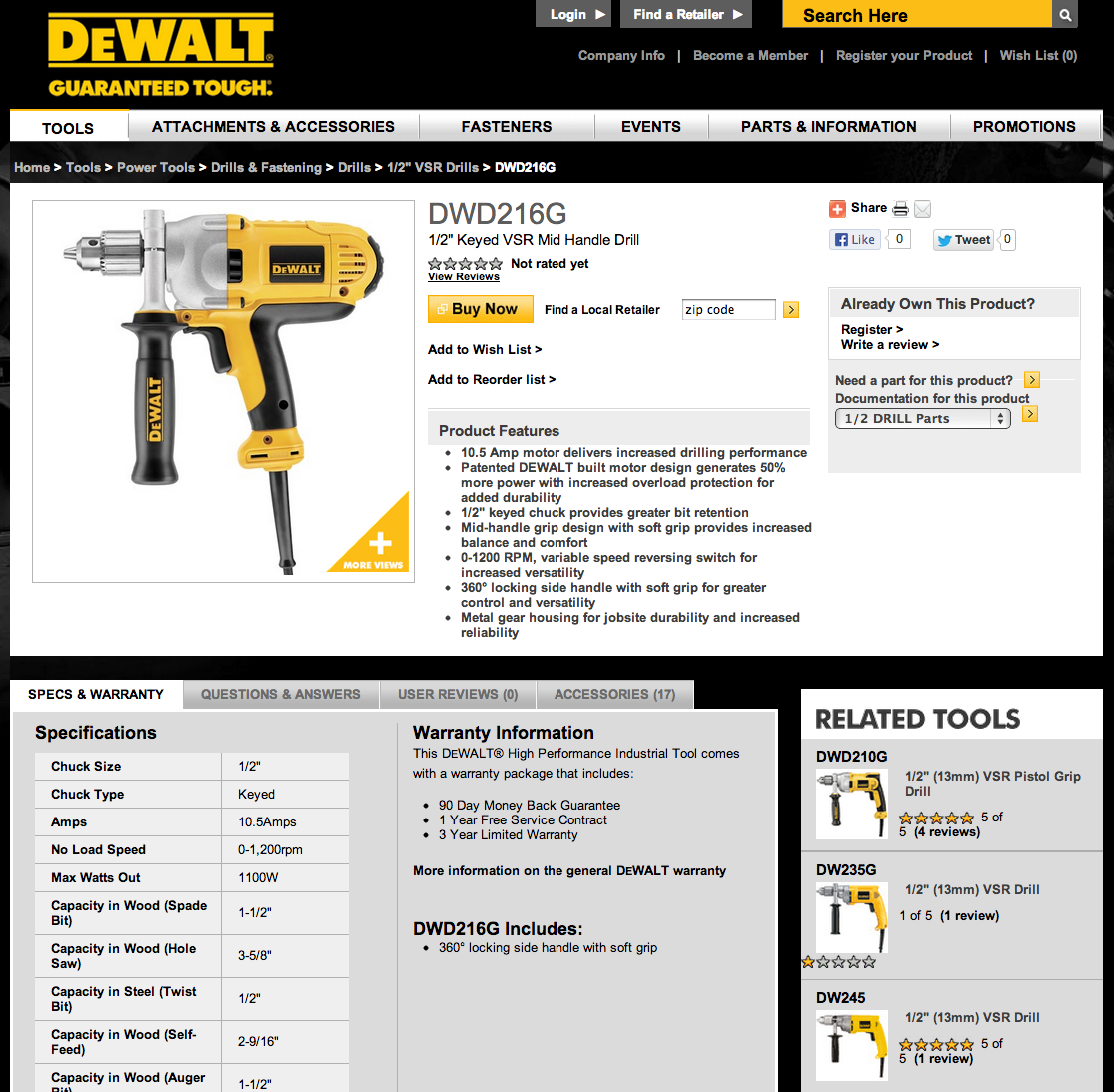
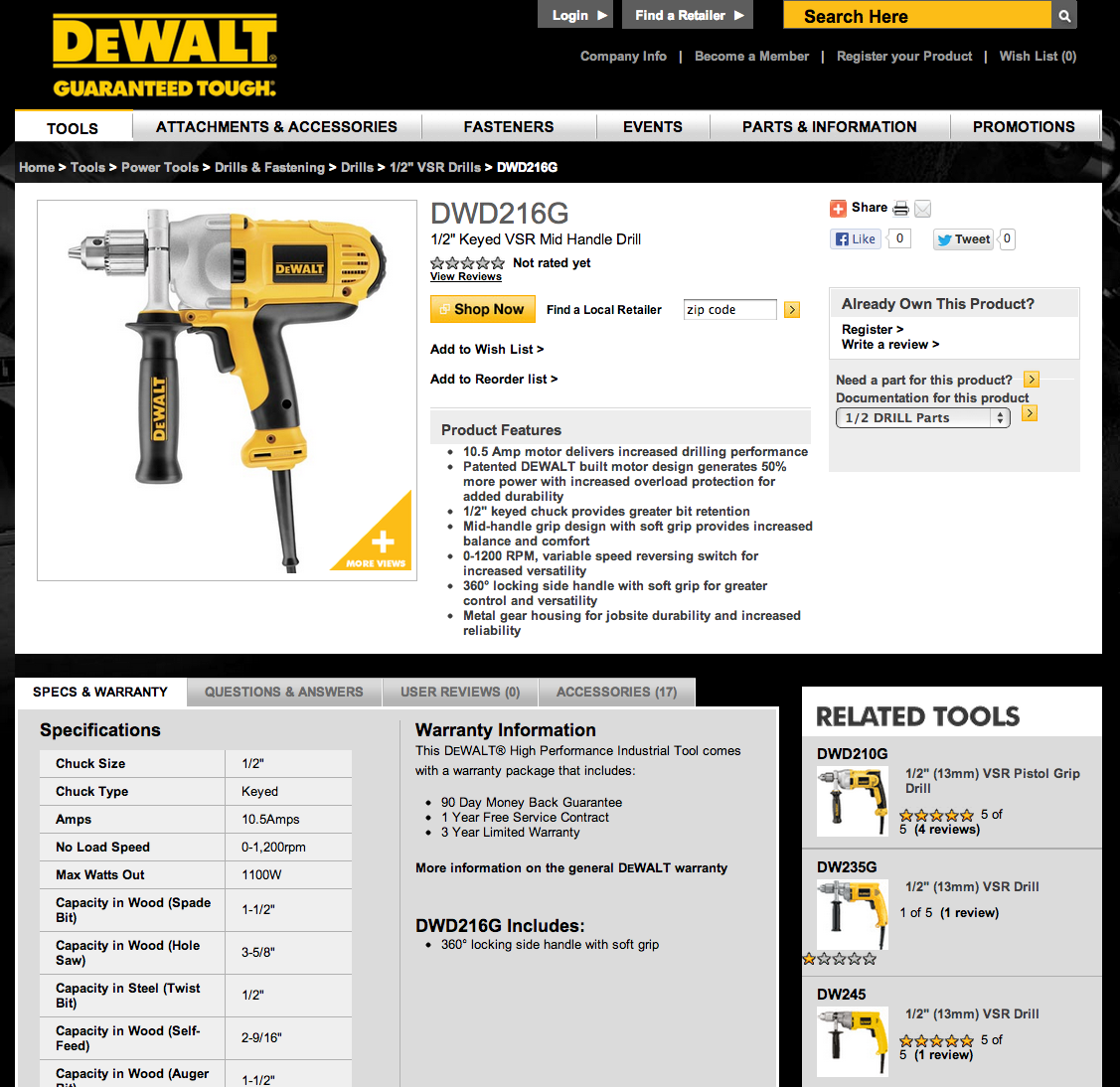
A Dewalt test compared two calls-to-action on product pages: “Buy Now” vs. “Shop Now.”  The button opens a window containing links to vendors that have the product in stock, such as Lowe’s and Home Depot.  To us, “Shop” seemed like a less-committal action, which might have caused more people to click the button, but it also implied a longer process to purchase -- we weren't sure.

Test #1

Version 1:

Version 2:

Result:  “Buy Now” drove 17% more people to click to vendors than “Shop Now.”  Projected over the course of the year, this single, small decision has a six-figure impact in online revenue -- so it’s a good decision to get right!

Test #2

Another Dewalt call-to-action test aimed to help more people use the site’s functionality to find local retailers.  We tested three naming differences in the top navigation: “Find a Retailer” (the original version), “Where to Buy”, and “Nearby Retailers.”

Version 1:

Version 2:

Version 3:

Result:  Both of the new versions actually outperformed the original; but, the big winner was “Nearby Retailers”, which sent 4.1% more visitors to use this functionality.  Thinking about it afterwards, the result made sense: “Nearby Retailers” was the only one that indicated a physical location.  “Find a Retailer” and “Where to Buy” could have both related only to online retailers -- so the winning version helped clarify.

Even when we make conservative assumptions about the percentage of people who ultimately go to a nearby store, and the average amount they spend, the increase in revenue thanks to this test is remarkable.

Test #3

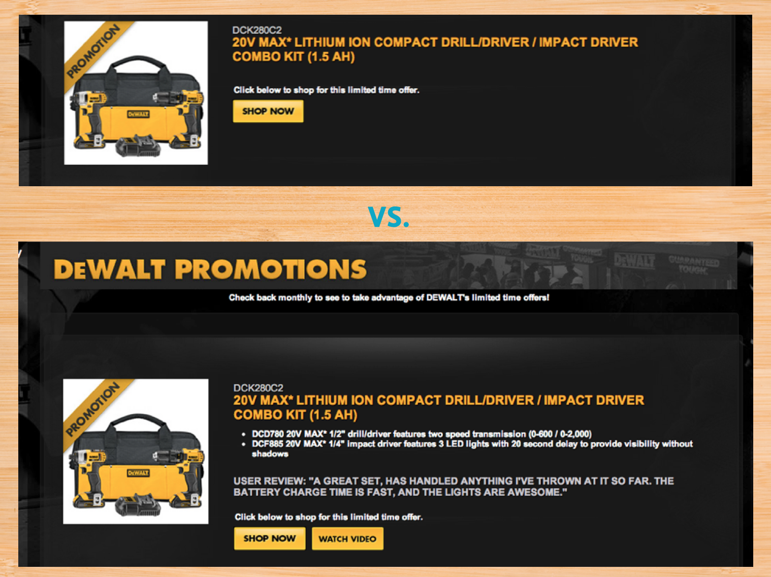
We also tested the Dewalt Promotions page.  Originally, the page included only a product name, photo, and link to buy.  The team had been bulking up the page with additional information, including text details about the product, user reviews, and outbound links to watch product demos on YouTube.  They wanted to understand the effects of these additional efforts. 

Result:  Surprisingly, the more streamlined version drove clicks to outbound retailers 26% more effectively.  As a result, the team had a more effective page while needing to curate less content. 

We did debate whether users were clicking the simpler version’s call-to-action more just to find out more about the product.  Since we couldn't measure which version people saw on these third-party retailers’ sites, we had to be satisfied that we were doing our part -- sending the traffic -- in as high a volume as possible. 

Test #4

We’ve also tested other brands: a test for Black & Decker was particularly interesting.  Some people suggest that users commonly scan pages in a “Z” pattern, eventually ending toward the lower right-hand corner.

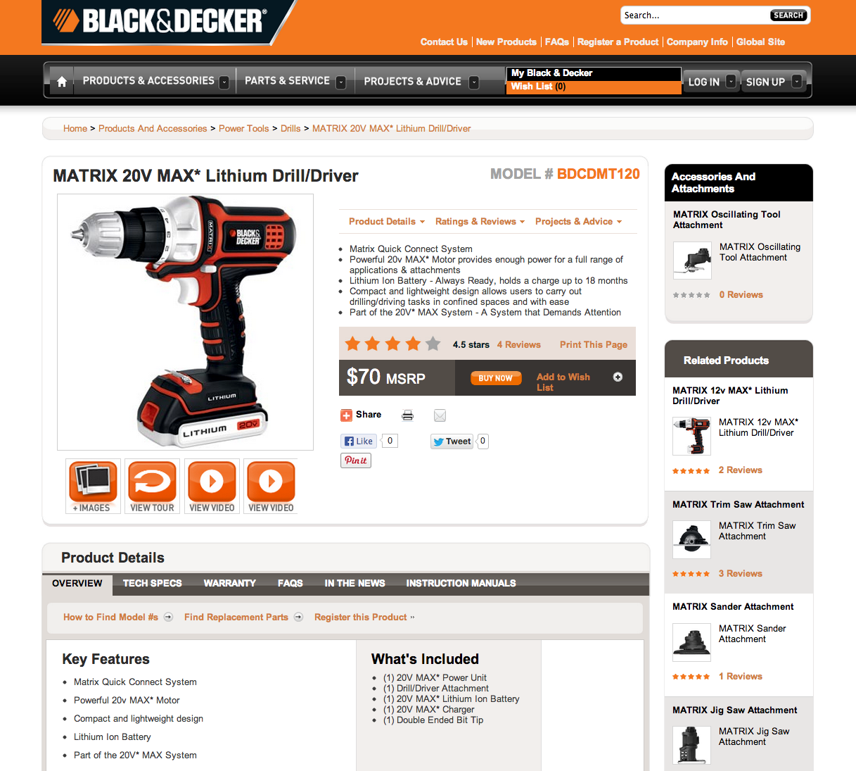
The existing Black & Decker product detail page showed attachments, accessories, and related products in the right rail:

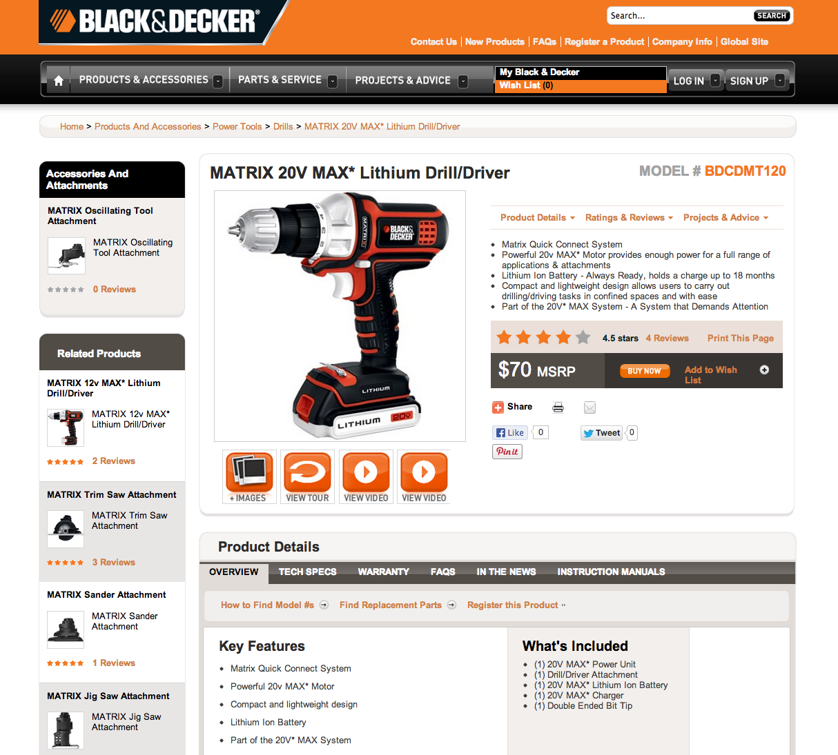
Black & Decker wanted to test how strong this “Z” scanning pattern actually was, by moving associated products to the opposite side of the page, which would bring the “Buy Now” button closer to the end of the user’s scan:

Result:  After testing more than 100,000 visitors, we concluded that it made no difference at all!  People clicked to Buy Now in almost identical frequencies on each of the two versions.  “No results” don't mean “bad results”, though -- we knew not to spend time debating this design decision!

What’s the takeaway from all these tests?  Should your links always say “Buy Now” and “Nearby Retailers”?  A frustrating (and fascinating) trait of digital marketing is the lack of many universal truths.  What worked for Stanley Black & Decker and their audience may have completely opposite results for yours.  So ... test it!

Internship Recruiting Numbers, Year Two

$
0
0

We’ve recently bid farewell to our remarkable summer intern class of 2013. As our now-former interns head back to campus with new skills and a stronger knowledge of the web industry, we’re looking back at the process that brought them to Viget in the first place.

Like last year, we know that data is key to understanding and improving recruitment. Last year marked the first time that Viget systematically collected recruiting data. We did it again this year which means that we’re now able to draw some comparisons. Below are some of the useful, new insights we’ve gained.

* Infographic design by Steve Schoeffel.

How many internship applicants did Viget receive?

This year, one of our explicit goals was to make our evaluation process more efficient so that we could keep applicants more accurately informed about our timeline for possible offers. In order to do that, we set a defined and much briefer application period of January 1st through February 15th -- a major change from last year’s roughly four-month evaluation period for which we set no strict deadline at the outset.

Despite the dramatically reduced application window, we saw our application volume more than double.

The size of our final internship roster also nearly doubled. But, both years, the main takeaway is the same: Viget is highly selective when it comes to internship recruitment. That's because one purpose of the internship program (among many) is to serve as a full-time recruiting tool. We know not every intern will be a full-time hire, but, when we evaluate applicants, we look for a level of past performance that indicates strong potential for joining Viget long-term.

Which labs received the most applicants?


Another major change this year: we introduced two new internships -- a Project Management internship and a Business Development internship. Moreover, there was significant overlap among applicants for the Marketing, PM, and BizDev internships; roughly 10% of the PM and Marketing applicants overlapped with each other, and 20% - 30% of the BizDev applicants also applied to PM, Marketing, or both.

The overlap makes some sense. These roles are business- and analysis-oriented without necessarily requiring either programming skills (as do the DEV and FED roles) or visually creative skills (like DES and UX). Understandably, students majoring in Business, Marketing, and Communications tended to apply for Marketing, PM, and BizDev -- or some combination thereof, speculating that they could be equally qualified for any of the three. We also see that, while there was some fluctuation between this year and last year in the number of applicants for our “maker” labs -- DEV, FED, DES, and UX -- the overall increase in volume occurred for the Marketing, PM, and Sales roles. It seems possible that introducing the two new internships brought us more applicants for Marketing than we may have otherwise seen.

How did applicants find out about us?

This year, we saw a significant increase in the percentage of students who heard of us through InternMatch. That’s not surprising. For a few years now, InternMatch has been steadily growing in its reputation among students as a great resource for finding internships. Additionally, unlike last year -- and thanks to a winning tweet in an intern advice competition -- Viget displayed a company profile on InternMatch, along with a job posting for each of our internship openings. Moreover, 77% of applicants sourced from InternMatch applied to Marketing, BizDev, and PM (this figure accounts for the overlap in those areas). Not only did our new presence on InternMatch contribute significantly to this year’s increased volume overall, but it also brought us most of our Marketing, BizDev, and PM applicants. This is helpful to know as we refine each of those internship roles in the future and possibly add new roles. For our “maker” roles, Internmatch isn’t the most valuable source, but for Marketing, BizDev, PM, and the like, it certainly seems valuable.

All that said, with recruiting -- as with most things at Viget -- we value quality over quantity. It’s interesting to note the greater numbers of applicants. But what we’re really looking for are those few, exceptionally talented students who show promise for making an impact on Viget and on our industry.

How, then, did applicants who got offers find out about us?

Like last year, our strongest applicants found out about us through some combination of their own online internship searches, various resources offered by their college career services, and "Viget Stuff" -- our blogs, events that we host or where our staff give presentations, referrals from full-time staff or former interns, and good, old-fashioned "word of mouth" triggered within students' academic, professional, and personal circles by these wide-ranging activities.

What’s the lesson, if any, for Viget? The truth is that there’s no single trick to successful applicant sourcing. It requires a combination of posting to the right sites, getting in touch with the best professors, staying in touch with former interns, and, most importantly, producing an internship program that, through its work and culture, makes its own best case for itself. By that token, it’s worth noting that many of the students in this year's "Viget Stuff" category cited “word of mouth” as the way they found out about us. That’s encouraging. I’m optimistic that, with year two of our annual internship program behind us, it’s becoming one that great professors and talented students spread the word about, organically, within their own communities.

The HTML Base Tag

$
0
0

So you handed off some front end code to a client last year. Now they've built out their site, stuff's changed, you don't have access to their code, and they want you to tell them why something's sporadically not working in IE 9 and 10. On a Friday. At 4:00pm.

How can we debug this?

  1. View source of the problem page.
  2. Copy and paste into your text editor.
  3. Drop the Base.

The Tag:

<base href="http://viget.com">

The base tag allows you to define the base url for all linked assets on your page - javascript, css, images, etc. Normally if you just copied the source of a webpage and opened it up in a browser - you'd just get some unstyled html and a whole bunch of broken everything. By adding a <base> to the top of your <head> tag, and setting its href to the url of the live site you're trying to debug, all those links are fixed, and you've got a working page you can now edit locally.

Now you can edit the markup, replace scripts and stylesheets with local copies, and start debugging in your own environment against an exact working copy of your client's live page, and make it home in time for dinner.

BONUS PROTIP™:

Another way to test files locally is through wget. You can download a single page of a site + all its source files re-linked up all nice and packged up to a single directory with the following command.

wget -E -H -k -K -p http://viget.com/extend/html-base-tag

Now you too can make your own addition to the growing list of Viget knock-off sites!

POST SCRIPT: After writing this, it was pointed out that we blogged about this 3 and a half years ago. Oh well. Enjoy the refresher!

Conference Recap: Startup Phenomenon Women

$
0
0

I recently attended Startup Phenomenon Women, a single day, single track conference in Boulder.  The event was organized by Startup Phenomenon, a conference series that works to act as a catalyst for startups from a wide range of industries.  It was the first time that they held this particular event.  The goal was to encourage and celebrate the role of women in startup communities.

The conference featured about 40 different speakers in a variety of formats including hour-long presentations, shorter insights on the same topic from 2-3 different people, and panels.  The talks ranged from informative to inspirational.  The majority of speakers were women but a small number of men presented as well.  About 500 people attended the conference.

My two favorite talks from the day covered negotiation and funding.

Negotiation

Margaret Neale, a professor at the Stanford Graduate School of Business, delivered a great talk on the challenges that women face when it comes to negotiating.  Some of the insights that resonated with me include:

  • Women often think of negotiations as being adversarial.  The image of going into battle feels overwhelming and pushes us away from negotiating.  We should redefine negotiations as collaborative problem solving.  There are countless opportunities throughout the day when we can make gains for ourselves and our teams by thinking of our conversations as negotiations. 
  • Women often don’t prepare for negotiations which is critical to success.  In order to be successful, we must have an understanding of our alternatives in case the deal fails (safety net), our reservation price (bottom line), and our aspiration (optimistic assessment of what is possible). 
  • Women often shy away from negotiating because they don’t want to be seen as disagreeable or difficult.  The cost of not negotiating, however, is extremely high.  Women perform better at representational negotiations where they feel like they’re fighting for someone else.  By creating a representational mindset (I am negotiating for my family, I am negotiating on behalf of my gender, etc), we can help overcome the hesitancies around negotiating.  

If you’re interested in more in-depth information from Professor Neale, I recommend reading this article or watching this video.

Funding

A panel discussion including Sharon Vosmek (CEO of Astia), Jo Anne Miller (Managing Director at Brown Dog Partners and Golden Seeds Angel Network), and Rob Hayes (Partner at First Round Capital) focused on startup funding.  Key takeaways from the panel discussion include:

  • In the United States, women are starting companies at 2x the rate of men but they are raising just 1/27th of the capital.  In tech industries, that number is 1/15th.  In many cases, this is due to women not fully leveraging their connections and not being as comfortable asking for capital.  Additionally, they may not ask or connect with the right individuals or organizations.
  • As an entrepreneur, you need to know what you bring to the table but more importantly, you need to know what others can help you bring to the table and then go find those people.  Hire people who are smarter than yourself.  Investors want to see a solid team that works well together.  They are most comfortable investing in companies with at least 2 or 3 founders. 
  • Find the accelerator that will provide the best connections for your individual business.  The most valuable aspect of these programs are the connections that you make.  Select a program that provides the best connections long-term for your goals. 
  • Pick an investor that fits with your business.  Don’t choose an investor based on who provides the largest sum of money.  It’s important to have a true partner that understands your business and will provide beneficial guidance instead of someone that may bring more funding but could ultimately steer your business in the wrong direction.


In my opinion, the talks on negotiation and funding were the most informative but the conference featured many other beneficial sessions as well.  Spending the day hearing from so many women with different backgrounds, roles, and responsibilities was really inspiring.  I’ll leave you with a little piece of that inspiration that Tiffany Dufu of Levo League shared. 

If you want something that you’ve never had before, you’re going to have to do something that you’ve never done before in order to get it. 

So get out there and embrace the challenge of doing something new!

Say Viget Behind the Scenes

$
0
0

A few months ago, I was thrilled to have the chance to redesign the Say Viget site. The goal was to teach people how to pronounce "Viget" correctly in a "sicky gnar gnar" kind of way that would impress the web community. Several crazy ideas were tossed around by the team: a music remixing site, how-to-pronounce video(s), a talking animal farm, and a platform game.

If an idea didn't scare us, then it wasn't big enough!

Out of all of the concepts, making a game was the best way for us to showcase our skills in HTML5 canvas, animation, illustration, and game design. After Dan Tello and Owen Shifflett's "Run Puma Run" HTML5 game came out, I knew that this feat was possible. Another big influence was the rising phenomenon of indie platform games like Limbo, Fez, and Dustforce.

FOUNDATION

At the time, I had zero experience making games, but I was committed to learning the foundations of game design. There are many things to consider when making a game: story, characters, level design, sound, animation, timing, physics, and, of course, entertainment value. Kevin Vigneault showed me an inspiring interview with Shigeru Miyamoto in which Miyamoto explained how he thought up the first Mario game.

Miyamoto’s insights made us really think about the psychology of creating different game elements for a platform game. Every object -- like a piece of brick or mushroom -- has a function and purpose that can change the dynamics of the gameplay. The design has to be simple yet descriptive enough for the user to know if an object is an upgrade, weapon, enemy, etc. Also, the placement of these items plays a big part in determining the rhythm and pacing of the level. 

GENERAL GAME CONCEPT

For the Say Viget game, we decided that the user would play as a hero character and try to reach the end of the level without falling off or running into dangerous obstacles. The user would also learn how to say "Viget" along the way by collecting items that activate sound bites to achieve the real goal of the site: teaching players to say “Viget” correctly!

PROJECT SCHEDULE

We finished the project within five months under a loose project schedule. The game was a labor of love for us; making time for it was almost as big a challenge as the actual development. Illustrations were squeezed in between client projects. Code was written over lunch breaks. Midnight oil was burned. The team was too excited about the game to let it fall by the wayside. 

CHARACTER DESIGN

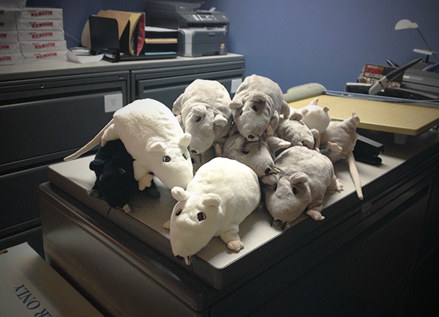
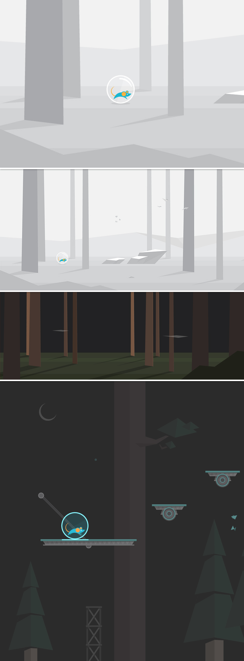
The team decided that the hero character should to be a lab rat, which is the company's mascot. We also felt that the character had to look timeless and unlike any other video game character. I included the Viget logo into the character design just as Doug Avery did with the Pointless Corp bear logo. Using Illustrator, I designed the rat in a minimalistic style around the two Viget circles while making the fewest possible anchor points. Numerous circular shapes were used to create the rat's body. It was a challenge to make the design simple while still clearly conveying that it's a rat. I decided to put the rat in a luminescent white ball so that its colors would pop and stand out against any background color. An additional advantage of this approach was that having the plastic ball around the character saved me from animating the rat's actual body colliding onto different surfaces in various angles.

Naming Our Hero

We named the rat "Junior" to reflect the fact that this project was our first time designing a platform game as well as Tommy Marshall's first time coding something in HTML5 canvas. The name "Junior" also plays with the notion that we went into this project eager to learn with a beginner's mindset. Plus, the name sounds cute and friendly. 

ANIMATION

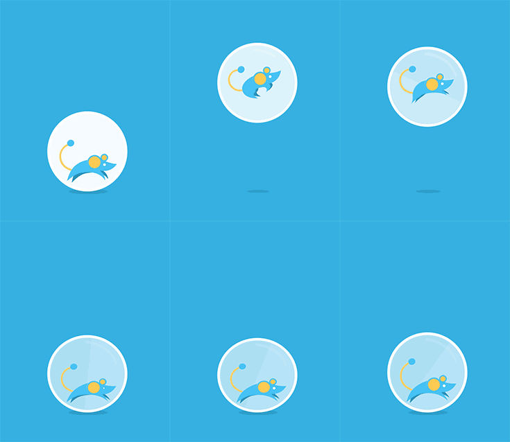
We wanted Junior's animations to look fluid and natural. For reference, I looked at Eadweard Muybridge's "Horse in Motion" 1878 piece and tried to emulate the horse's leg movements. 

JUNIOR ANIMATION PROGRESS

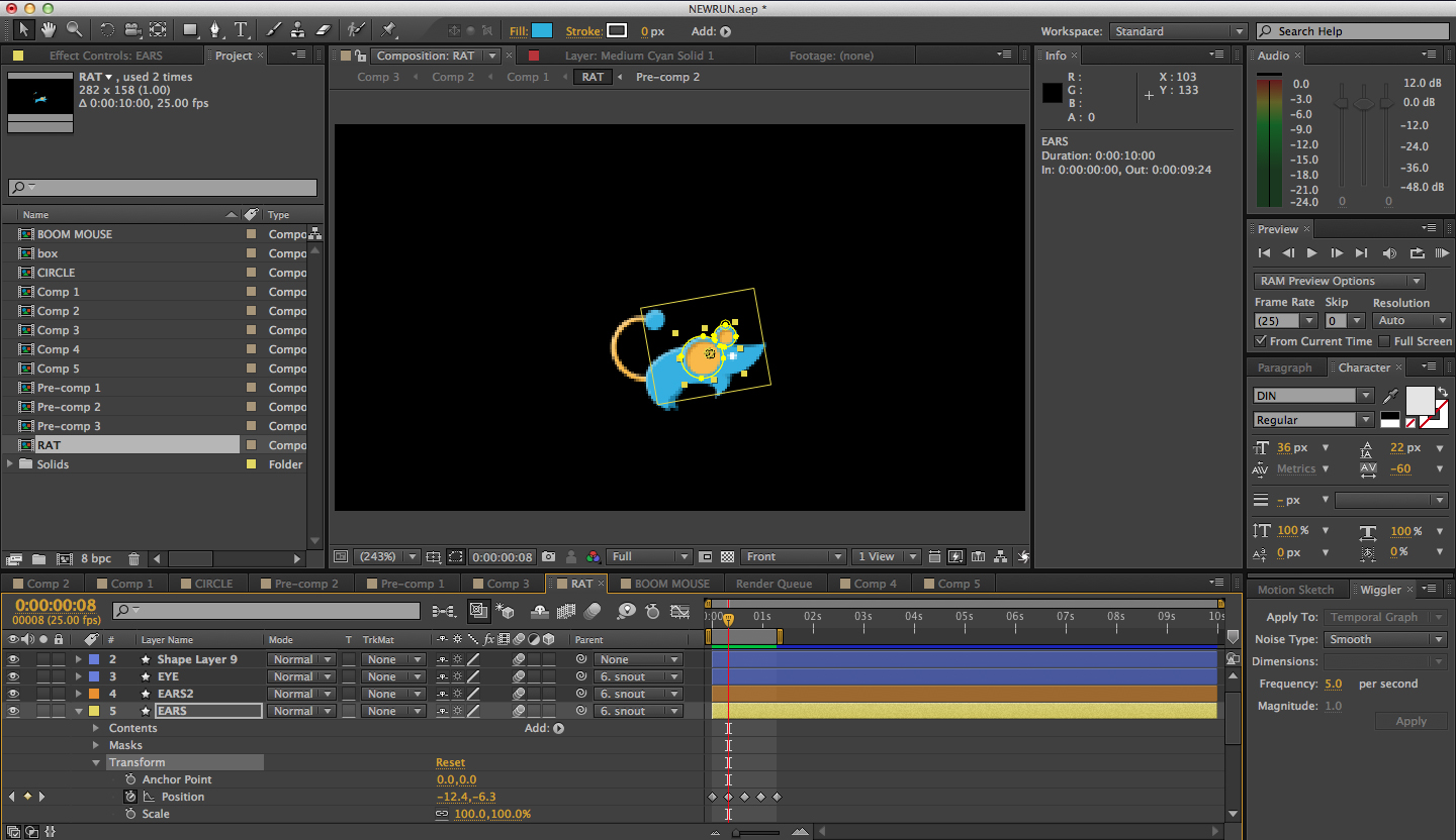
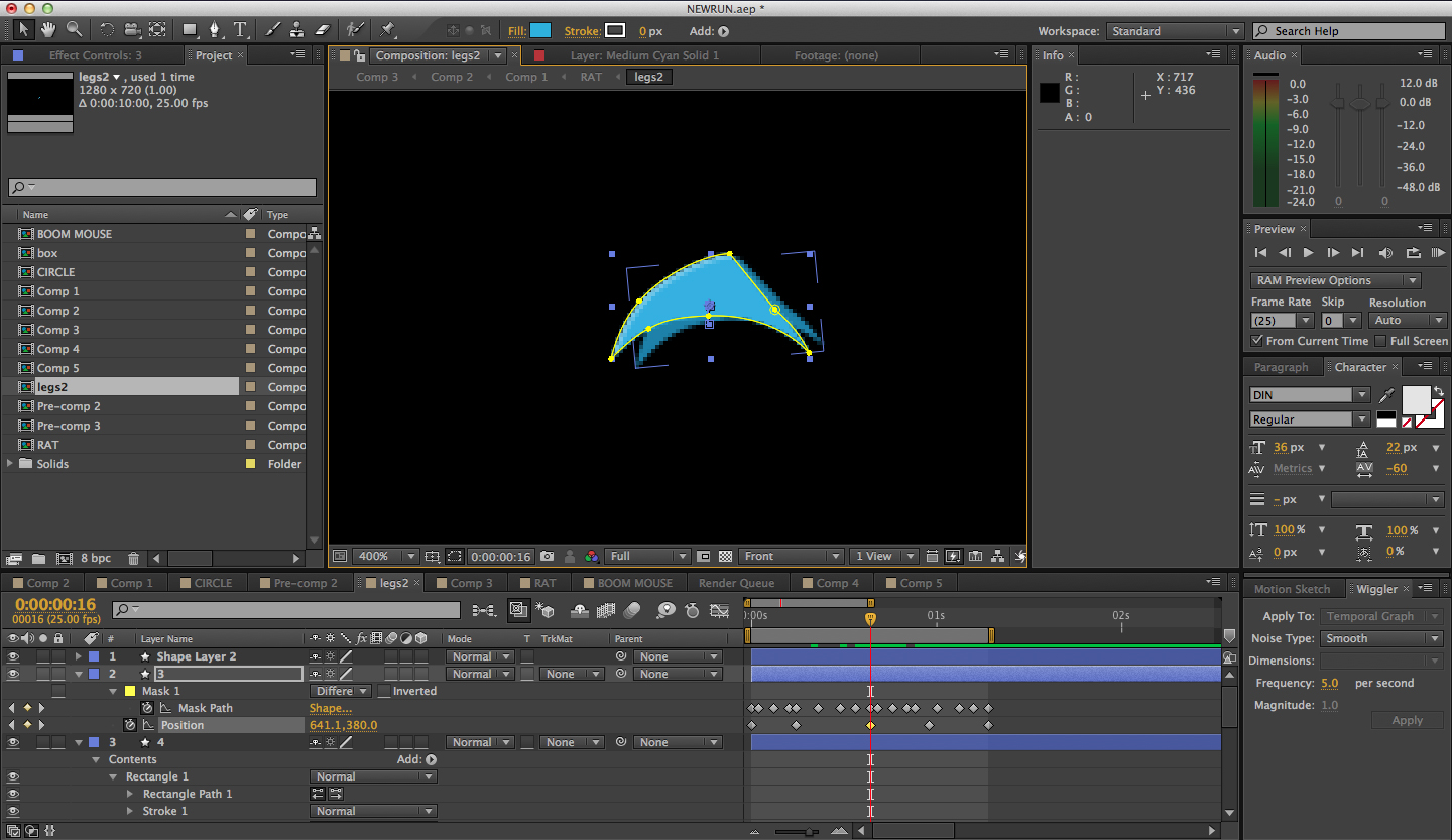
In After Effects, I created an animation loop for the running, jumping, resting, and run-stop movements. The rat was made out of vector masks created manually in After Effects. First, I imported an image of the rat design onto the After Effects composition. Then I traced over the image with the pen tool onto different shape layers containing mask paths. After animating the rat, I exported the composition into separate PNGs for Tommy to create sprites. He recommends using Sprite Cow.

LEVEL DESIGN

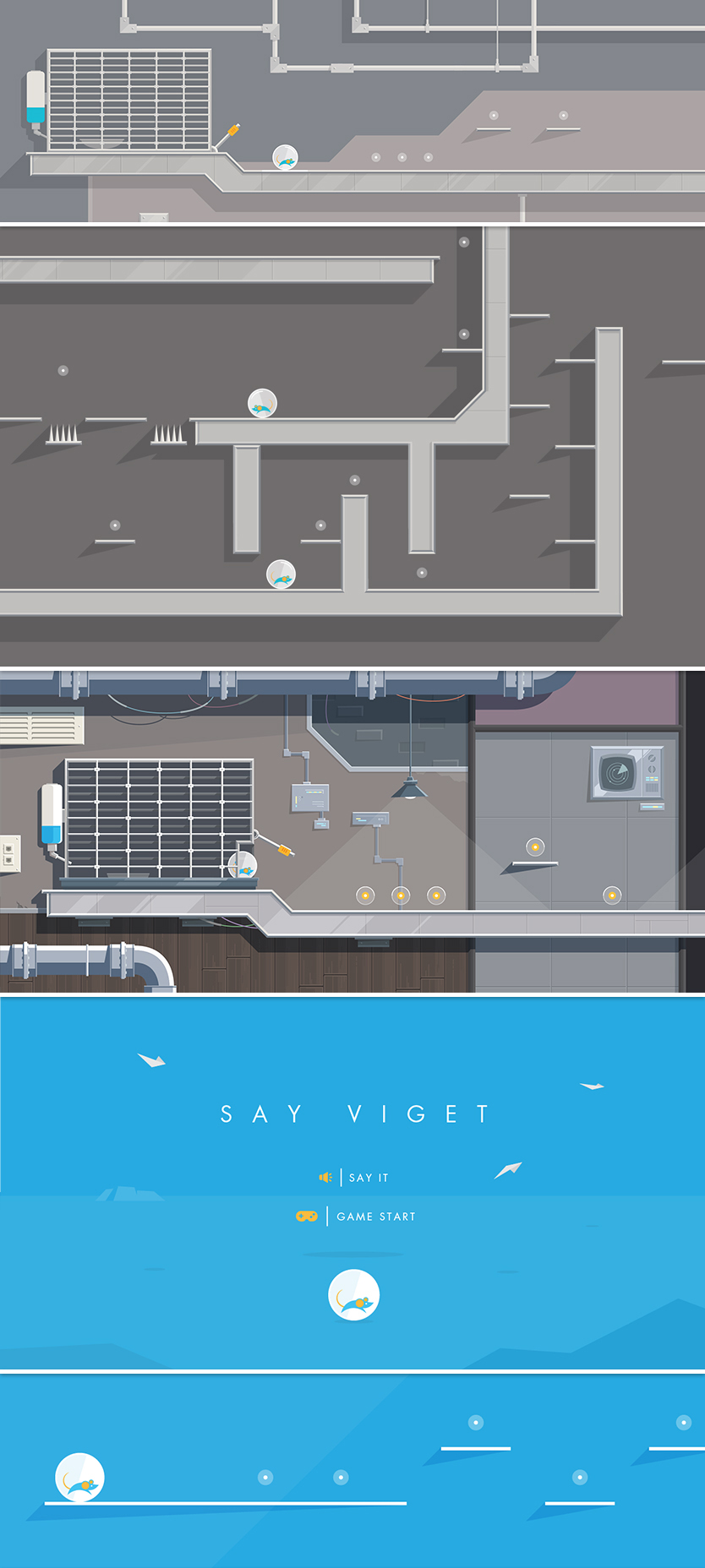
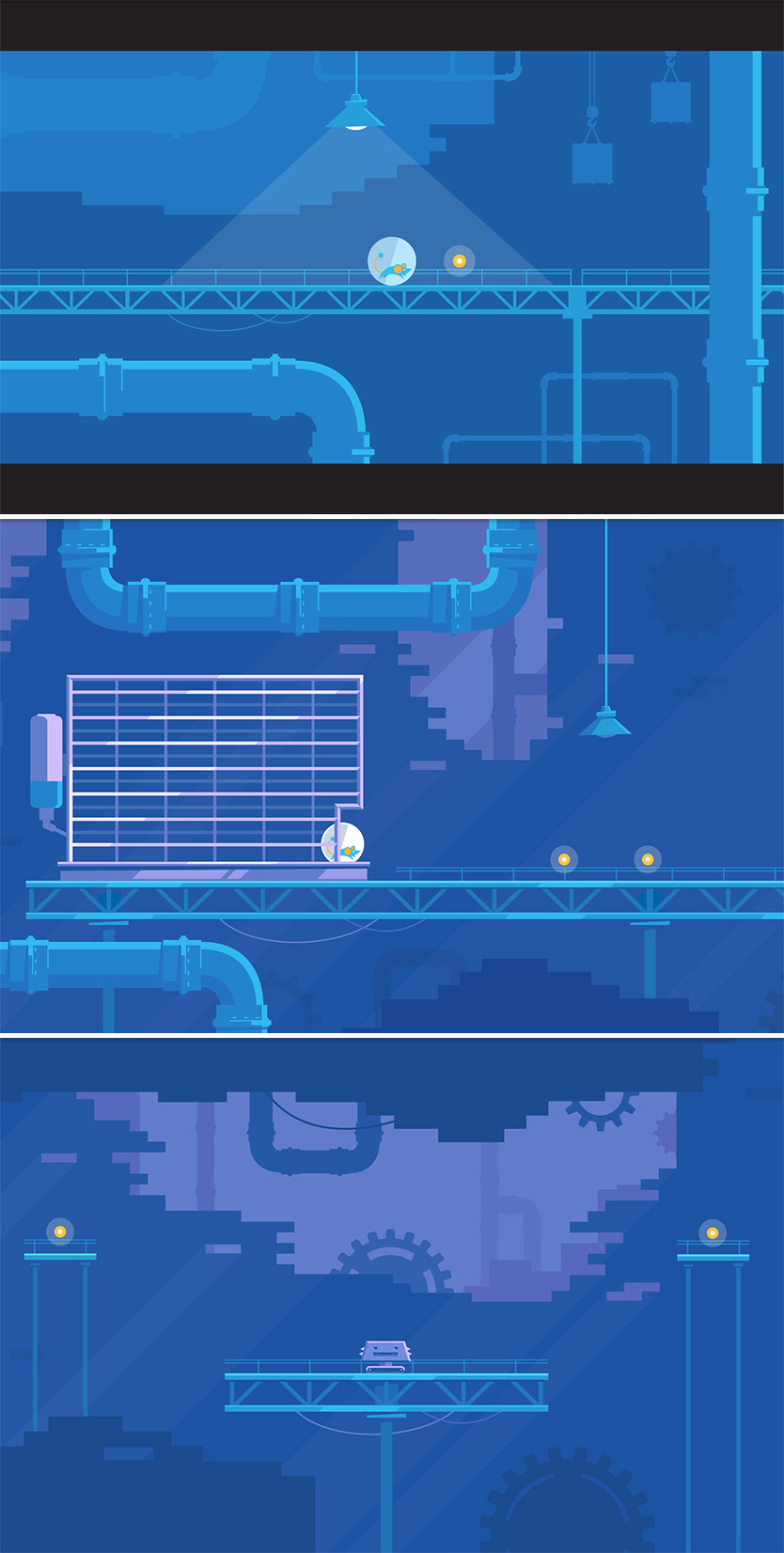
We generated quite a few different ideas for the level's environment: a forest, a low-poly geometric land, a laboratory, and a factory. I created a few "moodboards" for each level concept to get a general idea of the level aesthetics. Out of all of these concepts, the industrial factory allowed for the most fun level interactions like swinging platforms, cranes, rotating gears, sliding crates, levers, enemy robots, spinning saws, etc.

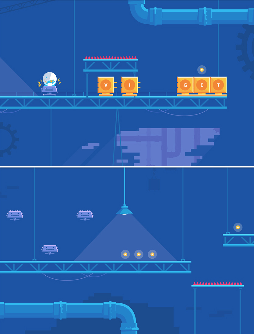
The team realized that making a highly detailed level in Illustrator would take too long to meet the deadline. Therefore, I broke down the design elements from the detailed factory level into simple shapes and silhouette objects. Vibrant colors helped create a playful and childlike tone throughout the game. Using blue as the dominant color conveyed a chill environment and harmonious vibe. The game's environment has a limited color palette to look more iconic and memorable. The result is a perfect marriage of the game's new simplistic look and the minimal character design. 

When designing the platform game, we varied the platforms' placements and added diagonal paths to add difficulty and intrigue as the player navigates through the level. Also, we made a special "pathway" for people who want to skip the coins and do a speed run (I finished the game in 19 seconds, come at me bro). As a result, the platforms are spaced out in a way that does not seem too overbearing or difficult to navigate. At the same time, we decided to increase the difficulty level near the end of the level so that the user would feel a greater sense of accomplishment once he or she finished. 
Parallaxing foreground elements added more depth to the game's 2D background and flat design elements. No single object contains more than three shades of color to keep things minimal.

Many level interactions had to be cut from the final product because of the deadline and other client projects occupying our time. In the end, we simplified our ambitions to finish the project while sticking with the initial objective of the site.

SOUND

After listening to over a dozen different soundtracks on AudioJungle, we chose this song for the background music. It was a perfect match since it was cheery, light, childlike, and not too overwhelming. Here are a list of other sounds we used: celebration, pain shout, and game coin pack.

LEVEL BUILDER

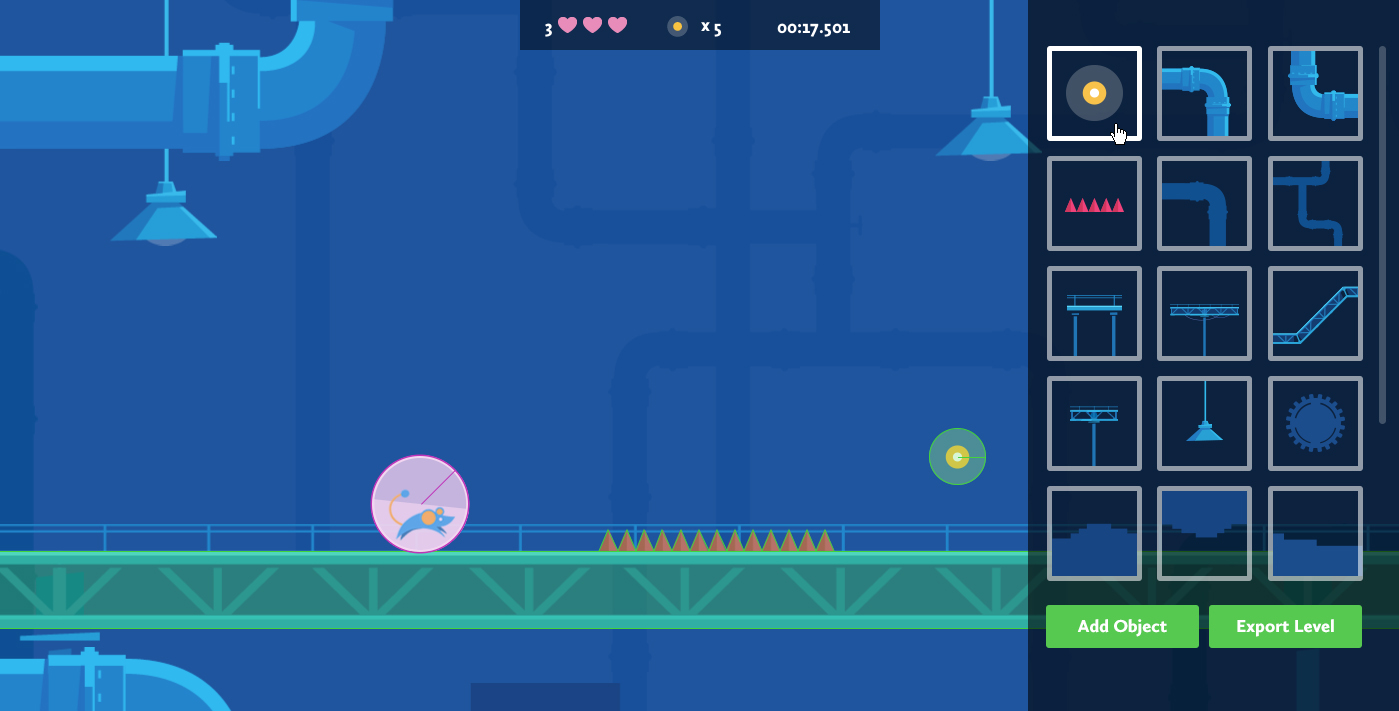
Instead of laying out each individual platform in Adobe Illustrator, Tommy ingeniously created a drag and drop level builder that operates in the browser.

The user can easily drag, drop, and move around individual level pieces like pipes, platforms, red spikes, coins, and other goodies onto the game environment. Afterwards, the user can save a rough draft of the level and play through it with the rat. By doing this, we had a better feel for the timing and pacing of the level which helped us measure the gameplay's entertainment value. The level builder acted as a more efficient "guess and check" process than comping out an entire level design in Illustrator and then manually setting each object's position values.
 

On June 18, 2013, Say Viget won the Awwward for "Site of the Day" in "recognition of the great talent and effort invested in its creation." Wahoo!

In the end, we're happy with the final product and had a lot of fun making it! Looking back, one of the most important lessons I learned is that it really is possible to seize upon a seemingly small opportunity to push your skill set and creativity far beyond their previous limits. Hopefully we'll be dreaming up more games in the future! In the meantime, play Say Viget!


The IKEA Problem: What Swedish Meatballs Teach Us About Development Crunch Time

$
0
0

I have a love/hate relationship with IKEA.  As I trek the many miles across the store, I’m excited to see so many great deals.  “OMG, I can get a TABLE for only ten dollars?!  What kind of magical place is this?”  I start piling end tables, picture frames, and bags of frozen Swedish meatballs into my big yellow IKEA bag like there’s no tomorrow. 

When I ultimately end up at the checkout, I’m always astounded by how my bag of seemingly inexpensive items somehow has a total price of several hundred dollars.  “How did this happen,” I ask my confused self.  If I didn’t pick up any big furniture items and all of these items are so inexpensive, why am I suddenly giving all of my money to IKEA?

This situation also occurs toward the end of many development projects.  Even if we’ve done a good job of controlling larger feature requests (we said no to that giant sectional, after all) and we think that we’ve set ourselves up for success, we get into crunch time at the end of a project and suddenly, the smaller features that we added along the way seem like a much bigger deal when viewed as an aggregate.

These smaller features aren’t an issue individually.  They’re typically simple enough on their own to not be a problem which is why, as we check in with developers throughout the planning and design process, we feel comfortable adding them in the first place.  But when you start combining the efforts of those smaller features — as well as the inevitable tweaks that arise through the iterative dev process — you may very well end up with an overwhelming amount of work.  If you’re trying to hit a firm deadline, you may realize that there’s too much to do and not enough time.

In an ideal situation, we would stop ourselves from adding these items into our designs in the first place (or at least not as many of them).  But we’re all human and our plans for what we thought we needed, what we thought we could implement, and what the total cost of all those features would be aren’t always accurate.  So what can we do when we find ourselves in this situation?


The first thing we need to do is review and prioritize the remaining features.  Then we can determine if any of them can be removed, postponed, or simplified.

Remove Features

That pack of frozen Swedish meatballs sure sounded like a good idea when you threw them in your bag.  You’re now realizing, however, that not only do you not have a kitchen to cook them in but you recently became a vegetarian.  Suddenly, they seem completely out of place.

We can get excited while designing and sometimes we add features that don’t really need to exist yet, if at all.  Things can change quickly throughout the design process as well and what was once important may no longer be so.  Don’t be afraid to admit that you were wrong about the inclusion of a particular feature or that the overall goals or direction changed along the way.  If there are any features that you can remove altogether, do so.

Postpone Features

Your new living room has all of the critical components.  Couch?  Check.  Table?  Check.  Lamp?  Check.  You really want to hang some artwork on the walls before the big housewarming party to bring everything together.  (Like really want to.)  But if you have to wait two weeks to hang up that artwork, is that really a catastrophe?

We have a tendency to turn nice-to-haves into must-haves.  Reassessing the remaining features and being honest with yourself about items that you can postpone until after the initial launch can help ensure that you hit your target date.

Simplify Features

You originally wanted to buy the end table with a drawer.  It looks nicer and provides a place to stash things.  The primary purpose of the table, however, was to have a place to set your drink on.  The end table without the drawer isn’t as nice but it will allow you to accomplish your primary goal and it’s less expensive.  You should get that table instead.

When it’s crunch time, you may need to find ways to take critical features and simplify them.  Boil down the feature to the primary purpose and see if there’s a way to achieve that in a less complicated way that can save development time.


As designers, we try our best to create designs that are realistic to build given the timeline and budget constraints (or at least we should try to do this).  Unfortunately, things don’t always go according to the original plan.  Certain items may take longer than expected or maybe you simply added too many small features.

While it is disheartening when you run into challenges at the end of a project, the most important thing is to focus on hitting the deadline with a functioning product that contains all of the critical features.  By working with the development team during crunch time to identify features to remove, postpone, or simplify, you as the designer can (and should) help make that happen.

Grunt: Getting Started with Git Hooks

$
0
0

Scenario: you work on a fairly large project with other developers. Getting the rest of the team to run tests before the build has been problematic. If only you could ensure that tests ran before code could even be committed...

Solution: Git Hooks to the rescue! Run anything you want before commits with the pre-commit hook. Like JSHint? Love unit testing? Run them before commits! The different hooks and potential uses are well documented, so let's take a look at their implentation and how we can improve it with Grunt.

The typical Git Hook implementation involves finding a hook (samples included in all repos) in .git/hooks, writing a shell script to do what you want, and then making it executable like chmod +x .git/hooks/pre-commit. This may not be appropriate for certain teams and could be difficult to distribute. Surely other people have already made this easier?
Enter grunt-githooks by Romaric Pascal. Getting up and running is simple. And most importantly, requirements easily transfer to collaborators.
npm install grunt-githooks --save-dev
// Gruntfile.js

grunt.loadNpmTasks('grunt-githooks');

grunt.initConfig({
  githooks: {
    all: {
      'pre-commit': 'test'
    }
  }
});
grunt githooks

Customization: Improving pre-commit

By default, the pre-commit hook will run tests against the entire working tree. But we should only test what's staged for commit, right? Luckily, the template option allows us to easily override the default with our own.

Here's the default plugin template:

var exec = require('child_process').exec;

exec('grunt {{task}}', function (err, stdout, stderr) {

  console.log(stdout);

  var exitCode = 0;
  if (err) {
    console.log(stderr);
    exitCode = -1;
  }{{#unless preventExit}}

  process.exit(exitCode);{{/unless}}
});

On commit, grunt-githooks runs the specified Grunt task and logs the output. If no error occurs, the process exits with 0 (success) and you can continue with your commit. The commit is aborted otherwise.

Expanding on this template with a few extra Git commands is not too difficult. First, install exec-sync to avoid some unnecessary callbacks.

npm install execSync --save-dev

Here's the custom pre-commit template:

// hooks/pre-commit.js

var exec = require('child_process').exec;
// https://npmjs.org/package/execSync
// Executes shell commands synchronously
var sh = require('exec-sync');

exec('git diff --cached --quiet', function (err, stdout, stderr) {

  // only run if there are staged changes
  // i.e. what you would be committing if you ran "git commit" without "-a" option.
  if (err) {

    // stash unstaged changes - only test what's being committed
    sh('git stash --keep-index --quiet');

    exec('grunt {{task}}', function (err, stdout, stderr) {

      console.log(stdout);

      // restore stashed changes
      sh('git stash pop --quiet');

      var exitCode = 0;
      if (err) {
        console.log(stderr);
        exitCode = -1;
      }
      process.exit(exitCode);
    });
  }

});

And further set up in your Gruntfile:

// Gruntfile.js

githooks: {
  all: {
    options: {
      template: 'hooks/pre-commit.js'
    },
    'pre-commit': 'test'
  }
}

// Register githooks as a default grunt task
grunt.registerTask('default', ['githooks', 'test']);

I've put this all together in a sample application at https://github.com/vigetlabs/grunt-git-hooks-demo. Now you're ready to start playing with pre-commit and anything else you want to add. Don't forget to run githooks (grunt or grunt githooks) whenever you make changes to hooks in your Gruntfile!

I hope you've learned something new around improving your workflow. Please share how you use hooks and Grunt in the comments below!

Viget Joins SoDA

$
0
0

SODA

SoDA is a non-profit membership organization founded in 2007 as the “Society of Digital Agencies” but has since broadened to the “Global Society of Digital Marketing Innovators.”  I consider myself more an engineer than a marketer, but even I get why they still call it SoDA rather than GSoDMI.  After a thorough evaluation process, Viget was one of just five companies invited to join in the most recent round of more than 80 agencies that were nominated for membership.

SoDA:

serves as a network and voice for entrepreneurs and innovators around the globe who are creating the future of marketing and digital experiences”

and is

focused solely on leading and representing top digital agencies and elite production companies through unparalleled collaboration, knowledge-sharing, business support and exploration of how technology can be leveraged to transform consumer experiences.”

It’s also a bit of group therapy for business owners, like Andy and me, who don’t get to talk with other owners as often as we’d like.  It’s not just for us, though -- SoDA connects discipline leads across companies, so Viget directors can learn from and share with peers around the world.

I love that our industry is open and collaborative.  I’m proud to be part of that culture, always willing to share what we know and how we work (as we’ve done here on our blogs for years).  Since starting Viget in 1999, I’ve made it a habit to connect with peers in the industry whenever I can, whether it’s a quick coffee, a roundtable dinner, or a multi-day retreat like our friends at Happy Cog organize with Owner Camp (also an awesome experience).  Every time I travel I try to meet other founders and CEOs, and while I can’t say that everyone is as open as we are, I’ve never had a bad experience with someone who takes the time to meet.

The founders of SoDA saw the value of these connections and created a lasting organization that allows successful agencies to share knowledge, best practices, and ideas for the future of our always-evolving industry.  We’re proud to be members, and look forward to both learning and contributing as much as we can.

Grunt Roundup

$
0
0

Two years ago, the front-end development team shared their favorite and most used tools for improving workflow in Doug’s post, “What’s In Your Toolbox?.” The following year, Grunt.js was released, and has since developed a growing and active community. We’ve started to use Grunt.js for various things and it has further enhanced and streamlined our build process with automation, optimization and testing. So as a follow-up to Doug's original post, I polled the team again, this time specifically about favorite Grunt tasks and plugins. Here’s what we all had to say:

Jeremy Frank

Assemble
This is a great plugin for small to medium sized flat site builds where a set of “static” HTML pages are handed off to a client for integration with a CMS. Support for Handlebars templates is baked-in, allowing you to keep you layouts, pages and partials separate. Just configure your “watch” task to run the assemble task whenever any layouts, pages or partials are modified. Pages are automatically built to your destination directory. Additionally, external data files can be supplied to templates, making it super easy to render the same information in different ways on other templates.

matchdep
Save yourself the time of manually writing calls to grunt.loadNpmTasks and use matchdep instead. It reads your package.json file and and allows you to filter and automatically load dependancies. Couple this module with loading external task configurations with node's require method, and you'll have yourself a super short and clean Gruntfile.

Doug Avery

Shell
Sometimes you just need to do it yourself — grunt-shell gives you the simple, but powerful, ability to add your own shell commands to a chain of grunt tasks. This is great if you’re up against a problem that no existing grunt plugin handles (restarting a server, mogrifying images, etc).

Copy
Bulk copy/rename files from source directories to targets. Belongs in nearly every toolset, since it allows you to non-destructively setup files and tmp files for more powerful chains. (Hint: If you need copy, you probably also need Clean.)

ImageMagick
Provides a simple interface for ImageMagick, and contains some especially useful shortcuts for resizing and generating retina/low-quality images. Works particularly well with https://github.com/teleject/hisrc

Nate Hunzaker

Require
Adds the ability to configure optimization builds of RequireJS. It also has a “done” hook should any sort of additional work (such as running other tasks) needs to happen

Lodash
Lodash has a ton of utility functions, but often we don’t use quite a few of them. This task allows you to configure what to include, by individual function or a suite, and set up things like what delimiters to use for templates ({{foo}} vs {% foo %}). I also think it does some other black magic that isn’t documented.

Testem
I like Testem because of how easy it is to set up. This task is just a way to set it up inside of grunt instead of a testem.json file.

Chris Manning

Grunticon
Grunticon takes a folder of SVG/PNG files (typically, icons that you’ve drawn in an application like Adobe Illustrator), and outputs them to CSS in 3 formats: svg data urls, png data urls, and a third fallback CSS file with references to regular png images, which are also automatically generated and placed in a folder.

Tommy Marshall

handlebars-helpers
This library of 100+ handlebars helpers is a dependency for assemble, with some helpful features like {{default}}, {{formatDate}}, and {{hyphenate}}.

Yours?

So those are some of our favorite Grunt utilities. What are some of yours? Let us know in the comment section. Also, be sure to check out Chris Manning’s post on using Git Hooks in Grunt, and some of our own homegrown Grunt tools: Grunterplate by Doug Avery and Grunt Complexity by Nate Hunzaker.

You Matter

$
0
0

I’m not sure if it’s a couple of talks that I recently saw at Peers Conference or maybe the fact that I’m just getting older, but I’ve been thinking a lot lately about work/life balance and personal health.

Work/Life Balance

Since we all love the work we do and can work virtually anywhere, it’s really easy to get in the habit of working too much. I remember when I first graduated college and started working in the web industry; I wanted everyone to know that I was eager and had a great work ethic. So I spent many late nights working, worked while eating lunch, and was spending my free time reading work-related books and blogs.

Sure, these things show that I have a great work ethic, but they also set a bad precedent. By working extra hours, I have reduced the time (not hours, real time) that it took me to build something. So during the planning phase for the next project, they will see that I completed a previous site in X number of weeks, and I can certainly build a comparable one in the same amount of time, right?

Sometimes people wear working a lot of extra hours as a badge of honor. But in my opinion, it should be looked at as a failure. It means that something failed during the process of the project. It could have been in the planning or execution, either way, something went wrong. Our goal should be to work normal hours. Working crazy hours and not getting enough sleep can be detrimental to your health. Remember, we aren’t saving lives; we are building websites. So remember to live your life outside of work.

One of the most influential talks at Peers was a talk by Greg Baugues entitled Devs and Depression. He has given the talk before, and I would absolutely recommend taking a half hour to watch the talk. He touches on a lot of important issues specific to our industry.

Diet

Food is fuel. What you eat is giving you the energy to do your job and live your life. So if you make bad food choices, you will feel sluggish, unmotivated, and dare I say, lazy. I’m certainly not suggesting that you can’t eat food that is bad for you, but just take a second to think what you are consuming.

Recently, I have started eating organic whenever I can. It's true that it is a massive and expensive change; it has changed a lot about what food I buy and where I buy it from. But think about this: would you rather eat a piece of chicken from a chicken that has been trapped in a small coop and never moved around or from one that has been free to roam around a pasture? The choice was easy for me and really changed the way that I think about food.

It’s tough. Working in an office means that people bring in all kinds of sweets, and at Viget we also have free lunch every Friday. So just be smart about your decisions. Even if the meal isn’t that healthy, try and have fruits and vegetables with every meal to balance it out. A balanced diet will improve your energy and generally make you happier.

Soda

How many more studies do you need to see regarding the risks of drinking soda (and energy drinks) before you stop? Obesity, kidney damage, diabetes, heart problems, and the list goes on. Seriously, just Google it. Many companies offer free soda as a perk (even Viget does), but just because it’s there, it doesn’t mean you have to drink it. There is this crazy drink called water, which is super refreshing to drink and isn’t slowly killing you.

Exercise

Think about how stagnant we are during a typical day:

  • in the car on the commute to work
  • all day at work
  • the commute home
  • watching TV
  • sleeping

Guys, that’s bad.

Personally, I’ve been trying to improve that by switching to a standing desk and reinstating the push-up club. During working hours, we have started doing push-ups at the top of every hour, whatever amount each person is comfortable doing. We have a Campfire room, and I use IFTTT to send a message to Campfire every hour (although sometimes it’s a little late).

Push-Up Club Campfire Room

Tommy started to mix in situps, and Antoine Butler also pointed me to this short workout. These things are small, but stuff like this gets you up and moving every hour.

Now, that is just a little something throughout the day to get our heart rate up, but regular exercise is still a must. I don’t think I need to list off the health benefits, but it’s also a great release to get your mind off of work.

Viget is always trying to find ways to make employees healthier and happier, and we are in the process of building an app that integrates with FourSquare to monitor your gym check-ins. Once you have fulfilled the monthly minimum number of check-ins, you will be reimbursed for the monthly gym membership fee.

Health Care

You can do all the things I’ve talked about above to improve your well-being and get sick less often, but there still may be times when you need a medical professional for assistance. Viget is super awesome and provides us with 100% health care, so find a company that cares about your well-being, and stick with them. Did I mention we are hiring?

So take charge of your health. Even if it is just a small incremental change, it will make a difference. Remember, you matter.

Viewing all 1271 articles
Browse latest View live