![Purpose and product - ecommerce design]()
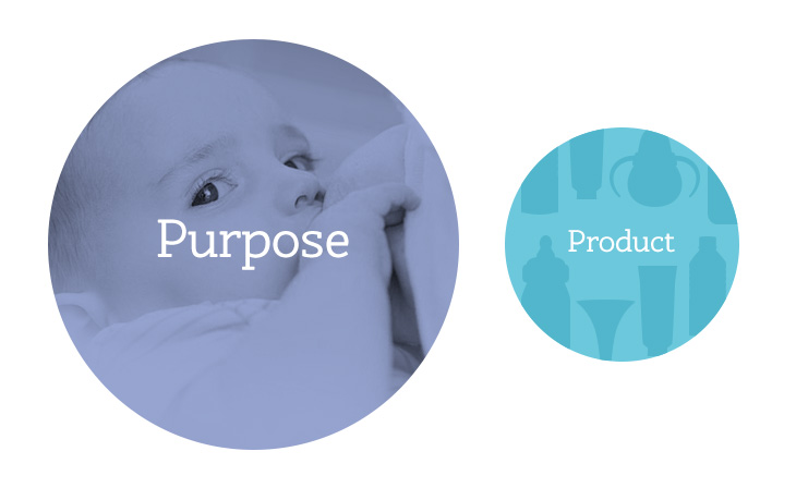
Look at any really successful product brand and you’ll see that they build their brand around a purpose, not a product. Our decision making is largely guided by our primitive brain, and that’s what we tap into when we design for emotional response. We know people don’t just buy a product because it functions the way they need it to. They buy it because it makes them feel a certain way. We often buy one brand instead of another simply because our gut tells us one feels “right”. Although we’d all love to believe we’re rational shoppers, in truth our purchases rarely have to do with specs, ingredients, or even efficacy.
Like everything else it does, our primitive brain starts deciding on a brand’s purpose immediately and unconsciously. In just a few split seconds those first impressions get cemented somewhere deep inside our minds. So sending out the right visual cues to instantly communicate a brand’s true purpose to the primitive brain is crucial.
Purpose is part of why working with Lansinoh was so much fun for me. They’re a purpose-driven company, and all of their feedback and input reinforced their commitment to being more than just a company that sells products. They get it right by sticking to what Simon Sinek calls the “golden circle” - they focus on the why (to support breastfeeding moms) and let the what and how follow with product lines that do just that. So when it came to their website, they wanted to make sure that products were balanced with content and messaging that supported new moms. They understood the importance of emotional design in an ecommerce site.
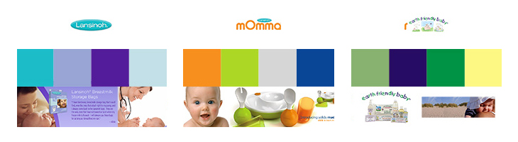
I know Lansinoh’s target audience very well; as a mom myself, and it wasn’t so long ago that I was seeking out their iconic purple boxes on the store shelves. Most moms recognize their packaging right away... and most dad’s have probably frantically scanned the aisle for it at some ungodly hour. Lansinoh is a brand with over 30 years of history to leverage, so I knew I would have a lot to work with. But I also knew that the existing online brand, which leaned very heavily on their signature purple, would have to stretch to fit two newly acquired product lines (mOmma and Earth Friendly Baby) that had their own distinct look and feel.
![]()
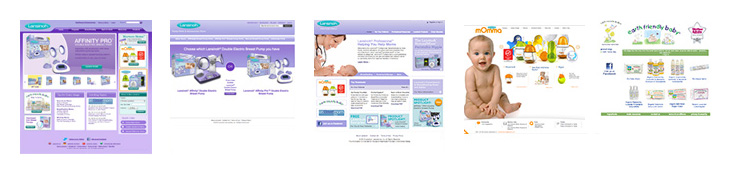
We started by evaluating the five sites we’d be merging. FIVE. Did I mention it was five? Three brand sites, an ecommerce site, and a site for breastfeeding professionals all rolled into one. That’s a lot of combining!
![]()
![]()
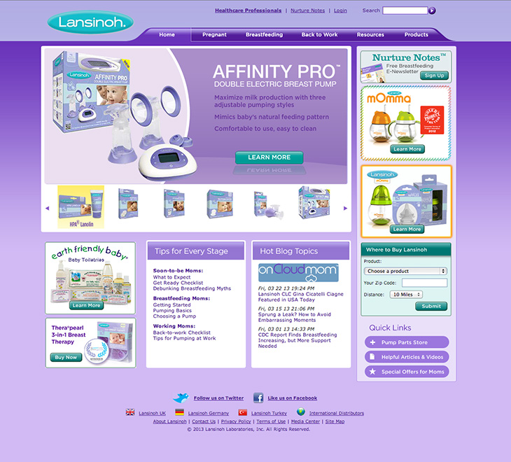
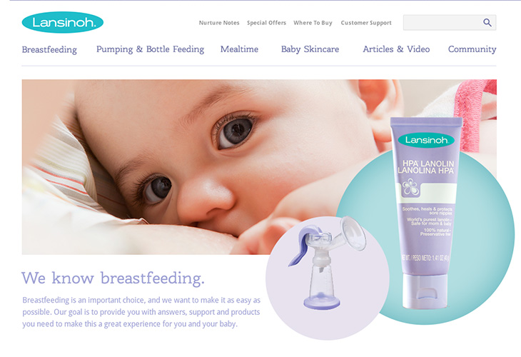
The look and feel across those five sites varied pretty greatly. On the old Lansinoh.com, heavy use of purple felt dated and boxed in their online brand. We completely understood their attachment to purple, but also recognized that online we weren’t competing for a user’s attention in quite the same way. They weren’t scanning the shelves for that familiar purple box; we had their eyeballs already, so we could lighten it up to let the content breath and better accommodate the new product lines.
Conceptually, the old designs weren’t as strong as their content. Despite housing some great resource content, they felt product-heavy and used very few lifestyle photographs. They lacked emotional impact. We knew this was something we could fix as well.
Finding An Honest Voice
I was full of ideas for the redesign, but all of them basically boiled down to this: the site should convey the sense of intimacy that comes with new motherhood, and it should be honest. If exhausted moms were searching the site at 4am with a newborn in the crook of one arm, I didn’t want their first impression to be perfectly coiffed model moms in stain-free white tank tops holding angelic babies in matching white onesies. That commonly seen, highly sterilized vision of motherhood feels way off to me, and a quick poll of other moms told me I wasn’t alone. Maybe we didn’t have to show the whole truth about new motherhood, because there’s nothing warm and fuzzy about day-old baby puke on your shoulder... but some of the truth? Some candidness, some reality, and a few faces who were naturally beautiful but not model-perfect? That much we could do.
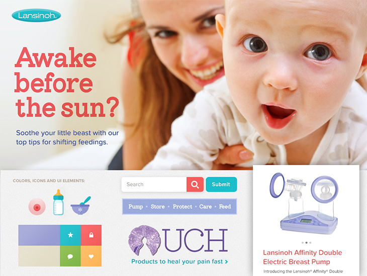
![Lansinoh.com Sample Mood Board]()
We started tackling this idea in the mood board phase, getting a sense for how comfortable everyone was with the “real deal” approach. We explored different levels of honesty, including things like photos with drool on a mom’s shoulder and a test-the-waters breast icon. Not everything made it past the exploration phase, but playing with both tone and communication style early in the game helped us all sort out the right voice for the site and happily, everyone agreed that “honest best friend” was the right route.
Solving Bad Stock Photo Syndrome
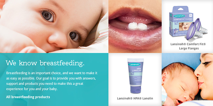
Once we nailed down the overall tone and concept for the site, we were off and running. To quickly communicate Lansinoh’s brand and purpose I knew I wanted big, beautiful, engaging photos that would feel welcoming to new moms. Close-ups of babies and kids photographed the way you might see them if you were the one caring for them. The ideal photos would include mom or dad nurturing, but they would not be the focus. We’re wired to feel an immediate emotional connection to a cute baby’s face; when I added in an adult face I found it broke the spell a bit.
Lansinoh didn’t have lifestyle imagery to go with their products, so early on Jackson and I played around with various design solutions that tried to balance product shots with stock lifestyle imagery. And even though I searched long and hard to find stock photos that didn’t feel, well, stock, the pieces felt like two different worlds I just couldn’t connect. I pushed things around and around...
![Lansinoh, Work in Progress #1]()
![Lansinoh, Work in Progress #2]()
![Lansinoh, Work in Progress #3]()
It never felt right. Eventually, I talked to my team about the gap, and we started throwing around the idea of a photo shoot. There wasn’t room for it in the existing budget, but we kept it as a “nice to have” for future client conversations. We moved forward with a layout that combined an image with a product, but wasn't quite as heavy handed with the product line. We were getting somewhere, but the need for lifestyle images was clear. How can we show a baby being fed without the beautifully designed mOmma spoon in the photo?!
![Lansinoh work in progress #4]()
Lansinoh saw the need for lifestyle product images and identified with the struggle to find “right fit” photos. Given the specificity of the subject matter, getting the right mix of babies with the right emotional tone was difficult, if not impossible, without a significant investment in higher-end Rights Managed photos. And with stock photos you always run the risk of seeing the same image turn up on your competitor’s website! So we talked through the options, including the idea of a custom photo shoot. It was an added expense, but one that was comparable to choosing generic Rights Managed images. And custom photos would do much more to strengthen the branding. We could show the products being used and bring in hints of the Lansinoh color palette to reinforce the brand.
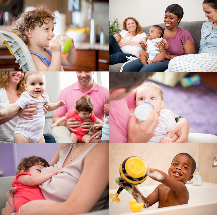
After some estimating and a few chats with our sales team, we got great news - Lansinoh had signed on for a custom photo shoot with our very own Zach Robbins. They knew enough moms and babies to fill our needs for models, and were onboard with our ideas for more honest and intimate images. Which meant... time to start prepping.
Knowing we only had one day to get the photos and a bunch of tiny, wiggling, impatient models with short attention spans to capture, we storyboarded each shot so everyone was on the same page. Zach, Heather and I worked together to come up with a detailed plan for the day. We blocked out an hour for each major shot, which gave us plenty of squish time in-between to capture extra images and candid moments that might come up. I brought my laptop and tested out shots as we collected them to make sure they would work in our layouts, which proved to be extremely helpful. The day was a huge success - the babies (and moms!) were very cooperative, Zach nailed the shots, and we left with exactly what we were hoping for. We were subbing our photos into comps the very next day.
![Photo Shoot Results]()
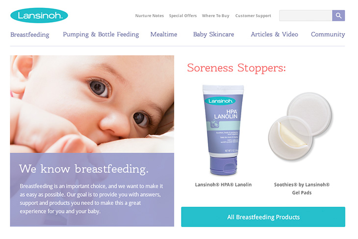
The Result
In the end, the site we launched was both highly usable and emotionaly engaging. It's modern, warm, and feels every bit a part of the Lansinoh family. The feature area photos tied everything together and brought the color palette to life. We pushed boundaries where it made sense, but always stayed true to the Lansinoh brand. And, oh yeah, we totally got to hold all the cute babies in these photos. How lucky are we?
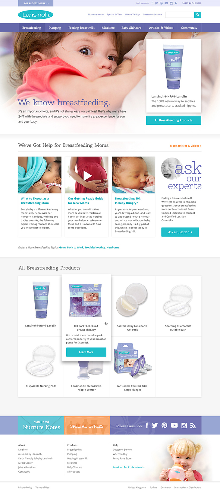
![Lansinoh Breastfeeding Category Landing Page]()
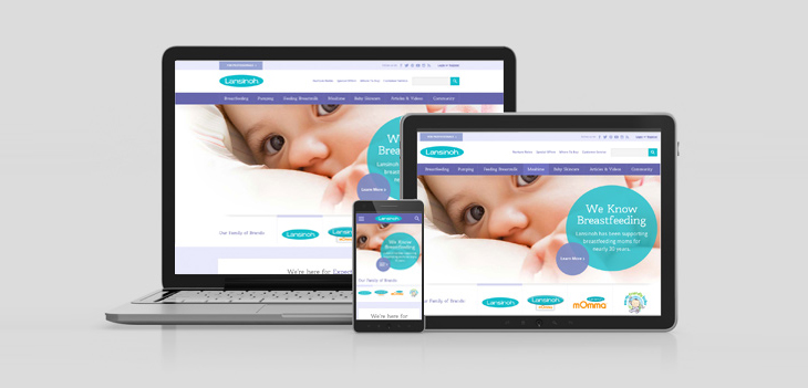
![Lansinoh responsive]()


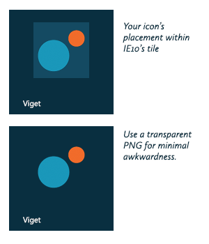 We're still not finished! Windows 7 simply used your 32px favicon to pin sites. But Windows 8 caught up with the icon craze and needs its own, unique assets. IE10 tiles are a little limited and tricky. The tile itself is 150x150 with a solid color background and a site's title in text towards the bottom of the tile. So where does your icon come in? It's an 80x80 square PNG in the center of the tile. Its actual dimensions are 144x144 to account for high resolution screens and devices. (Nope, your math isn't wrong. Now that you're used to doing everything 2x for retina, Windows has its own spin: do everything at 1.8x.) Since your image won't cover the entire tile, the best practice is to make it transparent. At least you can control the solid color it will sit on.
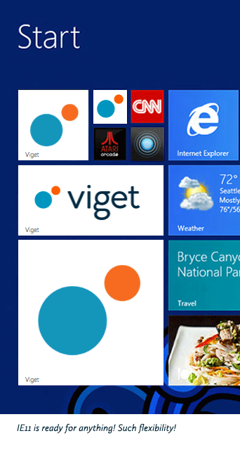 IE11 is a bit more flexible. Very flexible, in fact. You have full control of the tile's look; you also have a whole family of tile dimensions to design. There is:


